White Wedding Decor: How to Get It Right Without It Looking Flat
White wedding decor is the one I get asked about most, and also the one couples most often get wrong — not because they choose badly, but because they assume white is a single colour rather than a whole family of tones that need to work together. If you’ve ever held two “white” paint swatches up to a window and watched one turn grey and the other turn yellow, you already understand the core challenge here.
What White Wedding Decor Actually Means
At its simplest, white wedding decor means white dominates across florals, linens, furniture, lighting, stationery, and the ceremony structure itself. But that definition hides a lot of range. White stretches from bright optical white through ivory, cream, pearl, and soft grey-white, and the finished look can be classic, minimalist, romantic, rustic, coastal, or full-on glamorous depending on what you pair it with.
I think of white as a foundation rather than a finish. It’s flexible in a way few other palettes are — it reflects light, which makes venues feel bigger and airier, and it steps back to let architecture, floral shapes, and lighting do the talking. You can run it cool with glass and metal, or warm it up with wood and linen. It plays well with greenery, blush, deep emerald, whatever you fancy.
The mistake I see most often is treating white as flat — one tone, one texture, done. A room dressed entirely in the same shiny white satin looks like a hospital corridor with candles. Good white decor is layered: matte alongside glossy, sheer alongside woven, sculptural shapes next to soft ones. Vary your flower forms too. Ten identical white rose centrepieces in a row reads as repetitive, not elegant.
Why So Many Couples Choose It
White’s popularity isn’t really a mystery. It photographs well across almost every style of photography, from bright-and-airy to moody and film-like. It works with nearly any dress, any venue, any season. It sits comfortably at a village hall and at a five-star hotel ballroom without looking out of place in either. And it carries that long-standing association with elegance and celebration that a lot of couples want without having to explain their colour choice to anyone.
It’s also, practically speaking, easier to coordinate. White rentals are everywhere, white stationery suppliers are everywhere, and you’re not trying to colour-match four different vendors’ interpretation of “sage green.”
Where White Can Go Wrong
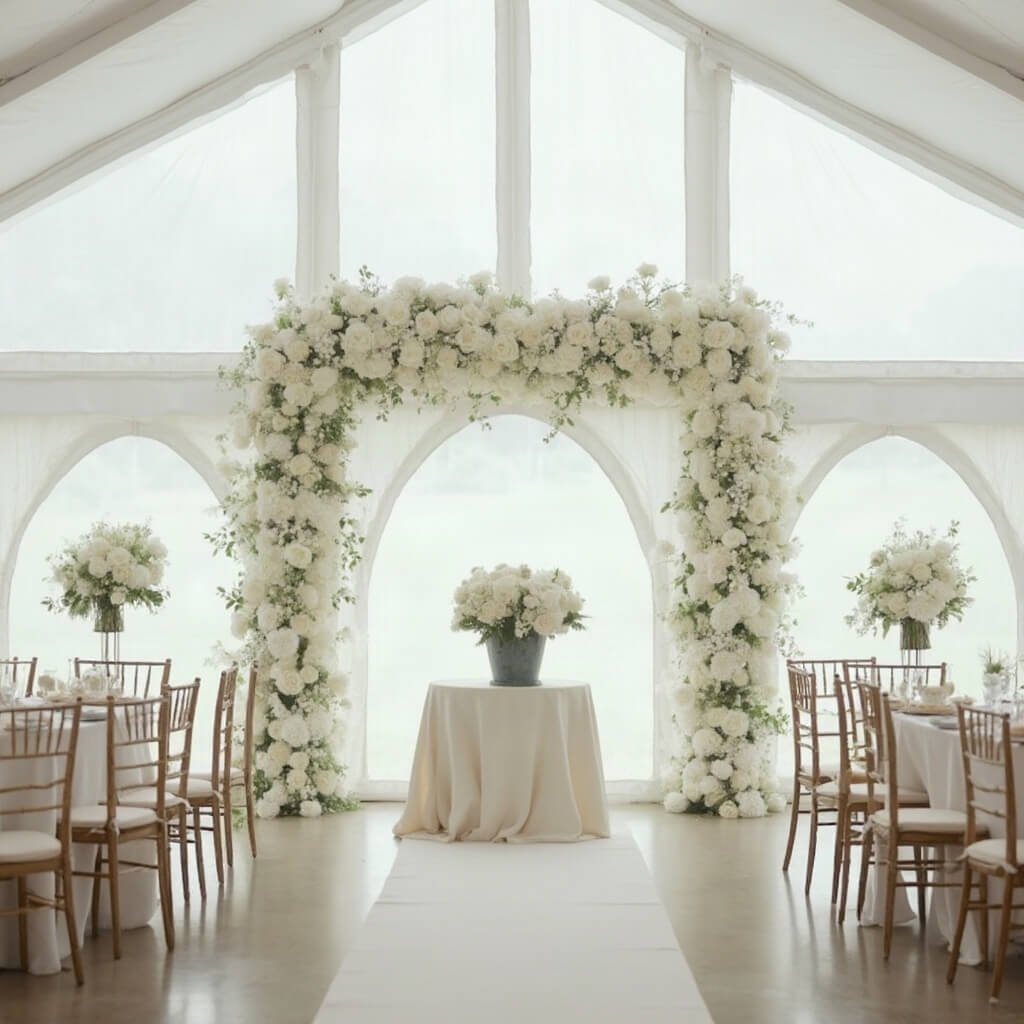
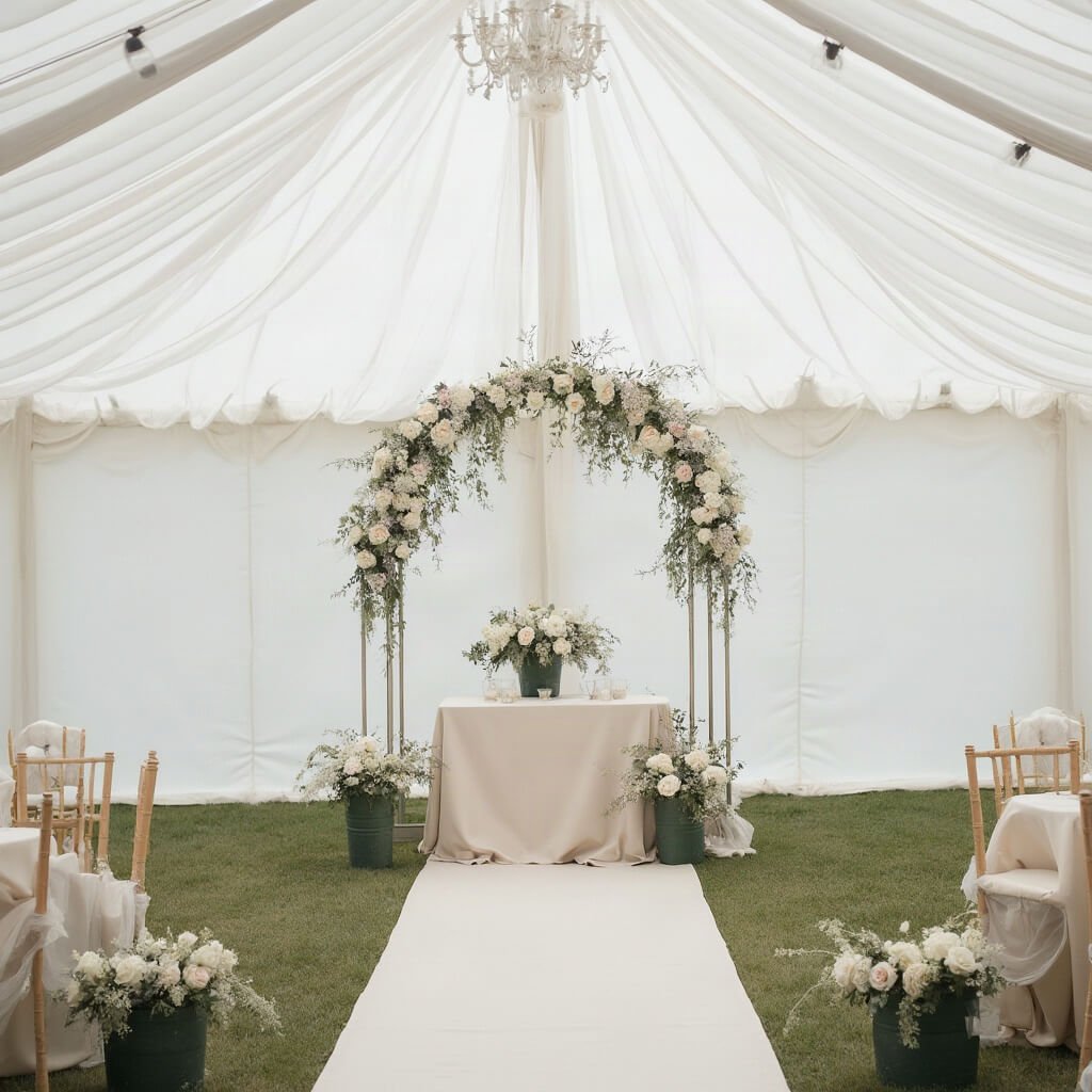
I’ll be the one to say it: an all-white room, done without thought, can look sterile. I officiated a marquee wedding a few years back — late September, drizzling on and off all afternoon — where the couple had gone white on white on white: ivory linen, white chair covers, white floral arch, pale grey carpet runner. Lovely in the brochure photos. In person, under the flat grey daylight coming through the marquee walls, it all blurred into one soft blob and the flowers barely registered. We ended up borrowing dark green florist’s buckets from the cake supplier just to give the altar table something to sit against. It worked, but it was a rescue job, not a plan.
A few practical headaches worth knowing about before you commit:
- White fabric shows everything — wine, candle soot, grass stains, mud from a wet car park.
- Different whites clash. Bright white tablecloths next to ivory invitations next to cream chairs can look like a mistake rather than a palette.
- White flowers can disappear into white backdrops in photographs, especially with soft, even lighting.
- Fresh white flowers in volume, plus draping, plus specialty white rentals, add up fast — this is not always the “safe budget choice” people assume it is.
- Always confirm with suppliers whether “white” means ivory, cream, champagne, or true white. I’ve seen couples get a tablecloth delivery that was technically white but read yellow next to their stationery.
Finding Your White Wedding Style
White isn’t a theme on its own — it’s a backdrop for one. Here’s how it tends to show up across different styles.
Classic and traditional.
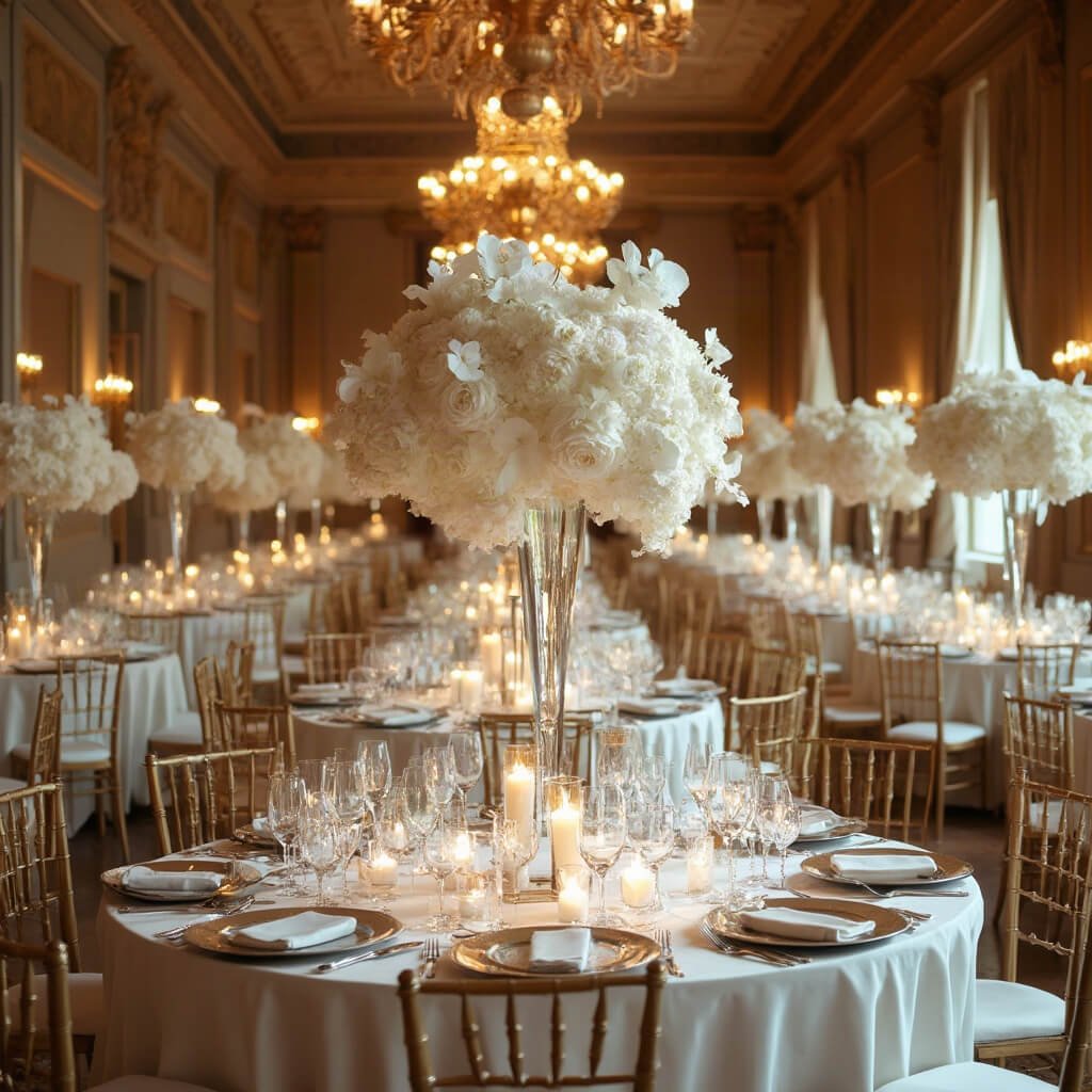
This is white roses, hydrangeas, lilies, and orchids, paired with crystal, silver, and polished table settings. Symmetrical aisle decor, formal centrepieces, the works. It suits a church, a historic estate, or a proper ballroom — somewhere with existing grandeur that the decor can match rather than compete with.
Modern minimalist.
Fewer elements, stronger shapes. Think sculptural floral arrangements, acrylic signage, white plinths. The palette stays tight — white, ivory, maybe black or one metallic — and the temptation to add “just one more little detail” needs resisting, because clutter undoes the whole effect. For inspiration, see minimalist wedding table decor.
Romantic and soft.
Ivory chiffon, lace, candlelight, loose florals. This leans cream and warm white rather than stark white, and a touch of blush or dusty blue can stop it tipping into feeling too austere.
White garden or botanical.
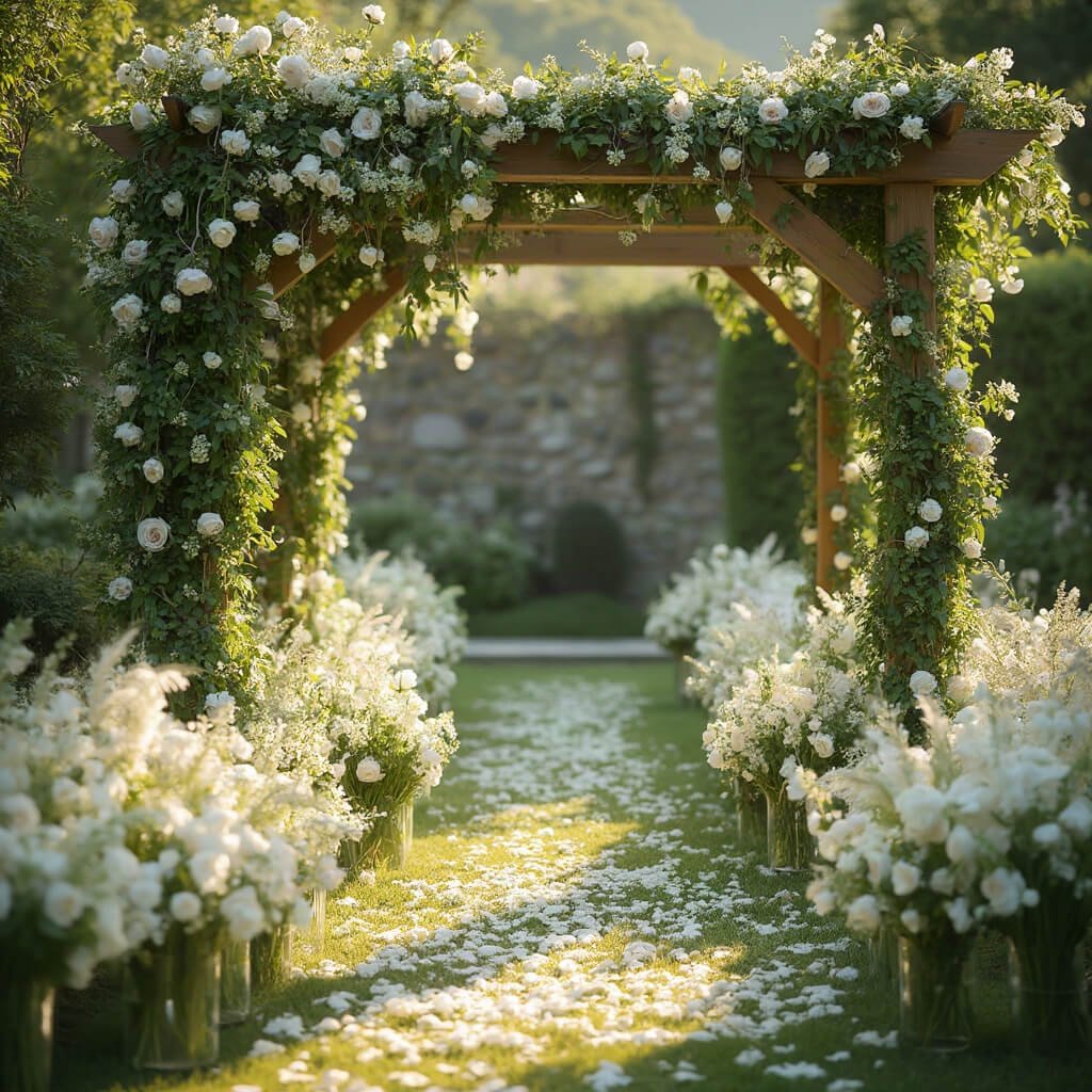
Here white flowers sit alongside green foliage, natural wood, and stone — garden roses, sweet peas, anemones, delphiniums. The best version of this style decorates what’s already there (a pergola, a tree line, a stone wall) rather than smothering the whole venue in new structures. Worth noting: green is having a real moment in its own right. One 2026 trend report found green appearing in 53% of weddings, ahead of white’s 39% — which tells you these two are increasingly a pairing rather than white standing alone.
Coastal white.
Linen, shells, pale wood, glass, woven textures. Low arrangements that don’t block a sea view, fabrics that can take a bit of wind. Humidity and salt air are the real test here, not the aesthetics.
Rustic and organic.
White flowers against raw wood, ceramics, dried grasses. Mismatched vintage vessels, reclaimed furniture. The trick is balance — too much distressed wood and exposed brick without any clean white textile and the whole thing looks unfinished rather than intentionally rustic.
Glamorous and luxury.
Orchids, crystal chandeliers, mirrored tabletops, metallic accents in silver, platinum, or warm brass. This style rewards one or two genuinely dramatic installations — a ceiling treatment, a custom dance floor — far more than it rewards decorating every single surface to the same high standard. Explore luxury wedding decor ideas.
Vintage and editorial.
Antique candlesticks, vintage china, lace, sculptural furniture — white as a gallery wall for interesting objects rather than a style in itself. Current coverage heading into 2026 keeps circling back to this idea: personal, artful, slightly nostalgic, rather than decor that could belong to anyone.
Building a White Palette That Doesn’t Fall Flat
Once you’ve picked a general direction, the next decision is what white is actually paired with — because strict, unrelieved monochrome is harder to pull off than people expect.
👇Shop the Look Here👇
A strict monochromatic white palette — bright white, ivory, cream, pearl, eggshell, all in the same room — can look genuinely stunning, but it only works if you lean hard on material contrast. Satin next to linen next to a matte ceramic vase next to glass. Without that variation, you get the hospital corridor again. Black text on white signage and stationery earns its keep here too, because without some dark anchor, legibility suffers and the whole thing starts to look washed out. Test everything together in daylight and then again under the venue’s evening lighting — a swatch that reads crisp white on your kitchen table can go distinctly peach under tungsten bulbs.
Save this article
Enter your email and we'll send it straight to your inbox.
White and green is the pairing I’d point most couples towards if they’re nervous about going too stark. Eucalyptus, olive branch, ruscus, trailing ivy — it suits garden, woodland, and outdoor settings particularly well, and it gives you contrast without introducing an actual “colour” to coordinate. The only real decision is whether your greenery is fresh, dried, or (controversially, but sometimes sensibly) artificial, especially if you’re decorating weeks in advance or dealing with a venue that has no cold storage.
Metallics are the other reliable route. Silver and crystal keep things cool and formal; gold and champagne push things warmer and more glamorous; brass and copper have become the organic middle ground that a lot of couples are gravitating towards instead of the cooler, more corporate-feeling silvers. Whichever you pick, repeat it — in the flatware, the candleholders, the frames on your table plan, the foil on your invitations. One stray silver candlestick in a sea of gold details looks like an oversight, not a choice.
White and black suits a more editorial, art-deco leaning wedding — black chairs, black menu cards, black-rimmed glassware. It needs restraint. Black concentrated in a few deliberate places reads as sharp and intentional; black scattered everywhere just fights the white for attention and nobody wins.
Pastels — blush, lavender, powder blue, butter yellow — soften things without properly breaking the white scheme, and they’re forgiving if you’re not entirely sure what you want yet. And then there’s the braver option: pairing white with something properly rich, like emerald, burgundy, rust, or deep teal. This is where a lot of 2026 wedding coverage has been heading — away from the “neutral and safe” white wedding and towards white as a bright, airy base for one genuinely bold accent colour, usually introduced through flowers, candles, or a statement linen rather than spread thin across everything. For more inspiration, explore Wedding Decor Trends.
Getting the Ceremony Right
The ceremony space is where white decor earns its keep, because it’s the one moment of the day where every guest is looking at the same fixed point for an extended stretch of time.
Set the Scene
Start with the entrance — it needs to signal “this is where it’s happening” without requiring a sign that shouts. White fabric swagged over a gate, a cluster of flowers either side of a doorway, a simple sign naming the ceremony location. If you’re outdoors, build in some tolerance for wind and rain; I’ve watched more than one beautifully arranged entrance come apart in a gust before the first guest arrived.
The aisle itself doesn’t need wall-to-wall decoration. Petals, floral clusters at alternating rows, candles or lanterns leading up to the front — pick one approach and commit to it rather than trying to do all of them. If your venue has a strict no-petals policy (a lot of historic churches do, for cleanup reasons), ask well in advance rather than discovering it on the morning.
Choose a Ceremony Backdrop
For the arch or backdrop, you’ve got real choice: a full floral arch, a draped fabric installation, a moon gate, a geometric frame, a whitewashed wooden structure, or simply using an existing tree or architectural feature and adding a little decoration to it. My advice, for what it’s worth after years of standing in front of these things — concentrate the flowers on one side or across the top rather than spreading them evenly. It reads as more contemporary and, frankly, uses your flower budget more efficiently than symmetrical coverage. Whatever you choose, match its scale to the space. A delicate arch in a vast marquee looks like an afterthought; an enormous installation in a small chapel looks like it’s trying too hard. For more ideas, browse these creative wedding decor ideas.
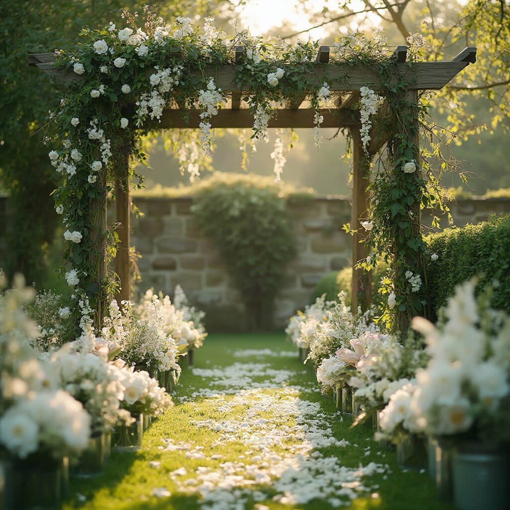
Chairs matter more than people expect. White chairs give you uniformity, which suits a classic or glamorous look; natural wood chairs give you warmth and contrast, which suits rustic or garden styles better than white-on-white ever will. And if you’re working with a tight budget, put your floral spend into the aisle or the arch — not both. Nobody notices the absence of flowers at the altar if the aisle itself looked beautiful on the walk in.
One thing I’d flag from years of officiating: white decor doesn’t carry the same meaning everywhere. In some cultures and religious traditions it’s bound up with purity and new beginnings; in others, white is associated with mourning rather than celebration. If you’re blending traditions, or if family members come from a background where white carries different weight, it’s worth a conversation before the florist order goes in — not to abandon white, but to make sure it’s being used thoughtfully rather than by default.
The Reception: Where the Budget Actually Goes
If the ceremony is the single focal moment, the reception is where white decor has to work hardest, longest, and across the most square footage — which is also where costs creep up without anyone quite noticing.
Style the Guest Tables
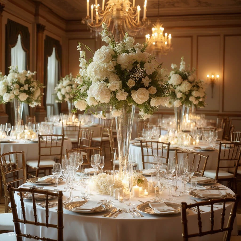
Guest tables are the backbone of this. A basic stack looks something like: tablecloth, a textured runner or placemat for contrast, napkins, chargers, flatware, glassware, a centrepiece, and place cards or menus. The detail that trips people up is height — tall centrepieces look wonderful in photos but can make it genuinely hard for guests opposite each other to hold a conversation. Mixing tall and low arrangements across different tables, rather than making every table identical, gives the room some visual rhythm and solves the sightline problem at the same time. Find more inspiration for minimalist wedding table decor ideas and round table wedding decor styling.
For centrepieces themselves, florals are the obvious choice — compact rose arrangements, loose garden-style designs, a cloud of hydrangea, a tall orchid stem — but don’t dismiss the non-floral options. Candles clustered at varying heights, white ceramic vessels, sculptural branches, a scattering of pearls, even a simple bowl of white-skinned fruit can do a lot of work for very little cost. I’ve seen couples spend their entire flower budget on centrepieces and then have nothing left for the ceremony arch, which is a strange way round to prioritise things given how briefly guests actually sit and study their table flowers compared with how long that ceremony backdrop is on camera. If you’re looking to keep costs down, these DIY Wedding Decorations on a Budget can help.
The head table or sweetheart table deserves a bit more attention than it usually gets, simply because it’s where the couple sits and where most formal photographs get taken. A floral installation behind it, or simple draping and candles, makes it a proper focal point without requiring you to decorate the entire head table the same way as every guest table — in fact, deliberately not matching it exactly is often what makes it read as special. See more luxury wedding decor inspiration for ideas.
Finish the Reception Details
On tableware, the decision between all-white china and mixed vintage pieces says a lot about which version of “white wedding” you’re actually going for. All-white china is clean, modern, and safe. Mixed vintage china — different patterns, slightly different shades of white, gathered rather than matched — has real character, and it’s had a strong run in tablescape trends lately alongside textured linens and the sort of deliberately imperfect, slightly handwritten feel that’s replaced the ultra-polished look of a few years back. Either is legitimate. Just confirm with your hire company whether their “white” china is bright white or ivory, because mixing the two unintentionally is one of those small errors that’s surprisingly visible once the tables are full. For more guidance, see these simple wedding table decor tips.
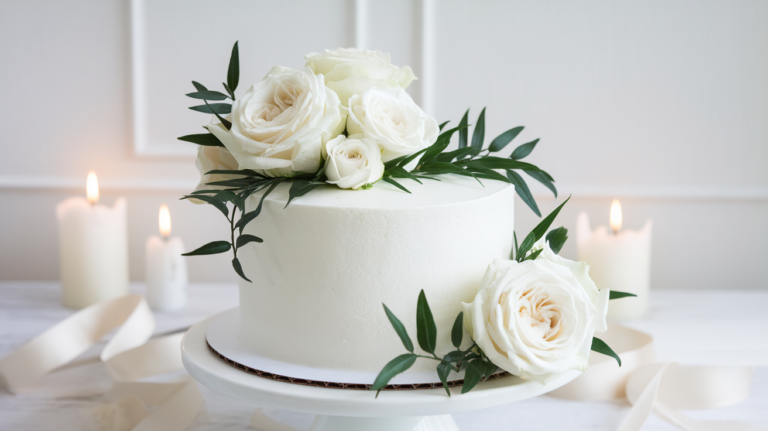
The cake table is worth its own thought too. A white cake against a white backdrop, under flat lighting, photographs as a vague pale blob — I’ve seen it happen at a reception with beautiful piped buttercream detail that nobody could make out in a single photo afterwards. Put something behind it: a darker linen, a floral backdrop, even just directional lighting that throws a shadow and gives the icing some dimension.
My Honest Recommendation
If you take one thing from all this: don’t choose white because it feels like the default, safe option — choose it because you actually want the layering job it requires. White wedding decor rewards couples who are willing to think about texture, lighting, and material contrast rather than those who just want to tick “colour scheme” off a list. Go and look at your venue in the evening, under the lighting you’ll actually have, before you order a single white tablecloth. If it still looks warm and inviting rather than flat and clinical, you’ve got the right foundation to build on.
👇Shop the Look here 👇
Want to keep this one?
We'll email you the link so you can find it again later.