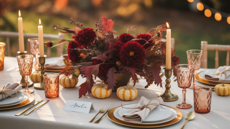
How to Create a Breathtaking Pastel Wedding Theme That’ll Make Your Guests Swoon
How to Create a Breathtaking Pastel Wedding Theme That’ll Make Your Guests Swoon
Planning a pastel wedding theme feels overwhelming when you’re staring at endless Pinterest boards wondering how to make soft colors look sophisticated instead of childish.
I’ve been styling weddings for over eight years, and I can tell you the number one worry I hear from couples is this: “Will pastels look too baby-like for our wedding?”
The answer is absolutely not – when done right.
I remember my first pastel wedding disaster back in 2016. Picture this: a bride who wanted “soft and romantic” but ended up with what looked like a toddler’s birthday party. Cotton candy pink everywhere, no depth, no sophistication. I learned that day that pastels need strategy, not just good intentions.
Why Pastel Wedding Themes Work Magic (When You Know the Secrets)
Pastels create emotion like no other color palette. They whisper romance instead of shouting for attention. They photograph beautifully in any lighting. They work for intimate elopements and grand ballroom celebrations.
But here’s what most people get wrong – they think pastel means picking every soft color available.
The real secret? Choose 2-3 main pastel colors plus one neutral anchor.
My go-to winning combinations:
- Blush pink + dusty blue + sage green + ivory
- Lavender + dusty rose + light grey + cream
- Pale yellow + powder blue + sage + ivory
The Complete Pastel Wedding Styling Timeline (No Stress Required)
Phase 1: Planning and Sourcing (1-2 Weeks Before)
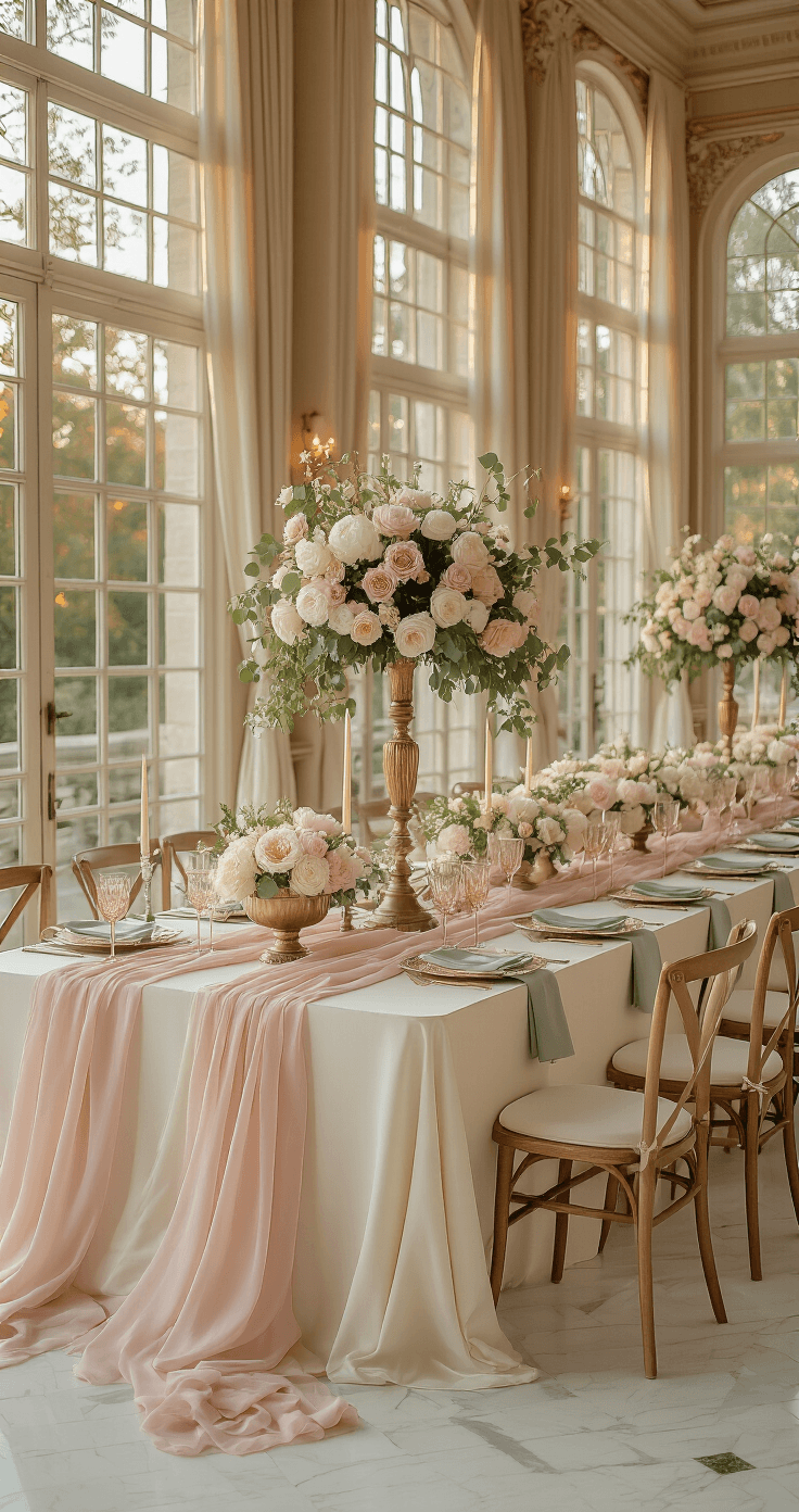
Start with your venue’s natural lighting. Pastels sing in bright, naturally lit spaces. They struggle in dark, cave-like venues.
Best venue types for pastels:
- Garden venues and conservatories
- White or neutral ballrooms
- Rustic barns (when softened with the right linens)
Shopping list for pastel perfection:
- Pastel table linens in your chosen palette
- Pastel taper candles for romantic height
- Vintage-style glassware in soft pink or frosted blue
- Simple bud vases for single-stem flowers
Phase 2: Day-of Styling (3-6 Hours with Helpers)
Start big, finish small. This rule has saved me countless styling meltdowns.
Hour 1: Background and large elements
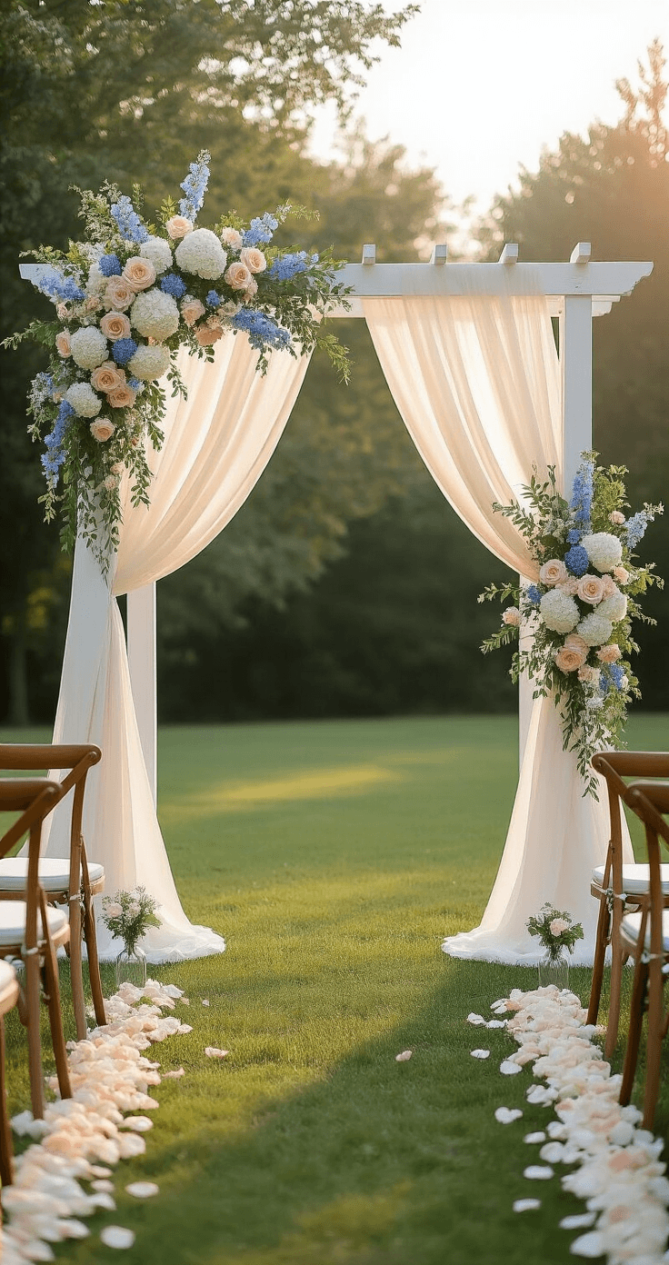
- Set up ceremony focal point (arch, arbor, or statement arrangement)
- Dress tables with base linens
- Position major furniture pieces
Hour 2-3: Florals and centerpieces
Save this article
Enter your email and we'll send it straight to your inbox.
- Install ceremony florals
- Place reception centerpieces
- Add greenery garlands or backdrop florals
Hour 4-5: Layering and texture
- Add chiffon table runners for texture
- Place candles and lighting elements
- Style place settings and glassware
Hour 6: Final details
- Add stationery and paper goods
- Style favor displays
- Final adjustments and touch-ups
The Foolproof Formula for Sophisticated Pastel Styling
Rule #1: Texture Saves Everything
Flat pastels look amateur. Layered pastels look professional.
Mix these textures in every scene:
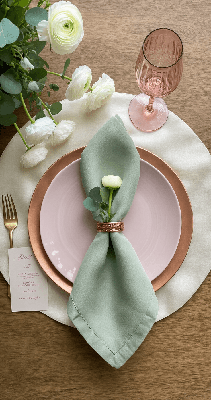
- Matte linens against glossy glassware
- Soft florals with metallic accents
- Smooth ceramics paired with rough natural elements
Rule #2: The 70-20-10 Color Distribution
This changed my entire approach to pastel weddings.
- 70% neutral base (ivory, cream, soft white)
- 20% main pastel color (your chosen hero shade)
- 10% accent pastels (supporting colors for depth)
Rule #3: Add Strategic Metallic Moments
Gold, rose gold, or copper elevates pastels instantly. Without metallics, pastels can look washed out. With them, pastels look intentionally elegant.
Best metallic touches:
- Flatware and charger plates
- Candleholder accents
- Picture frames and signage
- Jewelry and hair accessories
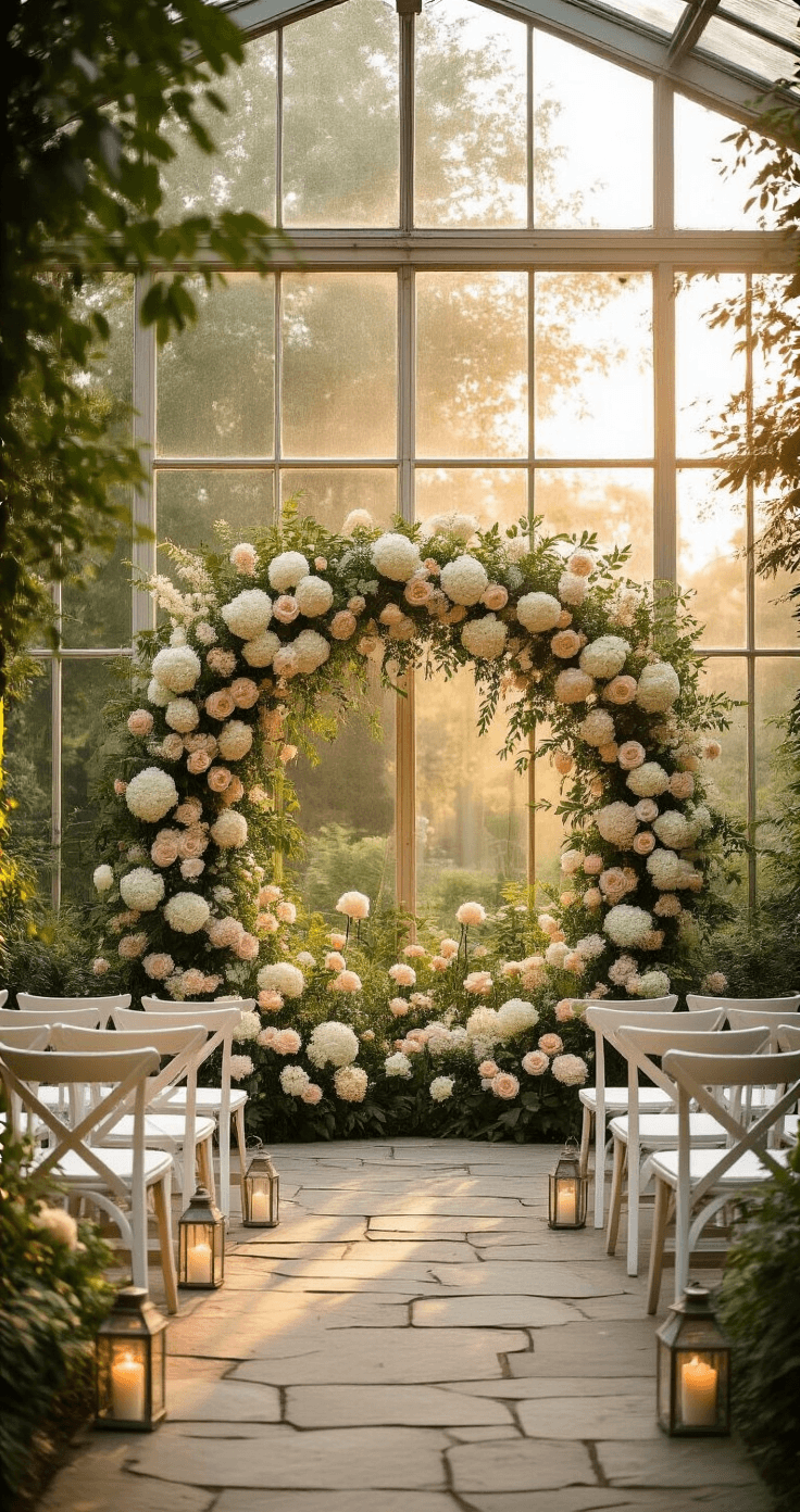
Pastel Floral Combinations That Actually Work
I’ve seen too many pastel bouquets that look like they raided a craft store.
Professional pastel florals follow these rules:
Base flowers (60% of arrangements):
- White or cream roses
- White hydrangeas
- Cream or blush peonies
Pastel accents (30% of arrangements):
- Soft pink roses or ranunculus
- Lavender sweet peas
- Dusty blue delphiniums
Want to keep this one?
We'll email you the link so you can find it again later.