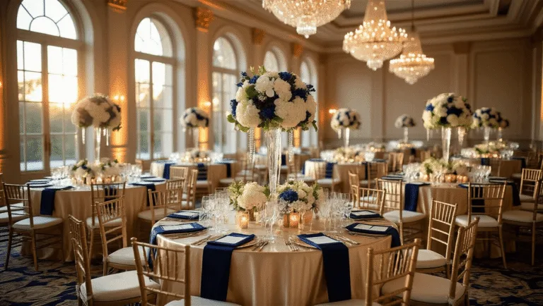
Purple and Burgundy Wedding Colors: How to Pull Off This Stunning Palette Without It Looking Like a Halloween Party
Why Purple and Burgundy Actually Work So Well Together
Before we dive into specific combinations, I want to talk about why this pairing works.
Both purple and burgundy sit in the same cool-to-warm tonal family. They share undertones that naturally complement each other — red, blue, violet.
When you put deep burgundy next to rich plum, something magical happens. They deepen each other without clashing.
Add a softer lilac or lavender into the mix and suddenly you’ve got dimension. You’ve got depth on one end and airiness on the other.
That contrast is what makes this palette so visually interesting.
It’s also incredibly versatile — which surprises a lot of people. This isn’t a one-season palette. Done right, it works in spring, summer, fall, and winter.
The Best Purple and Burgundy Color Palette Combinations
Here’s where I want to get really practical with you.
These aren’t just theoretical color theories. These are the combinations I’ve seen work again and again in real weddings.
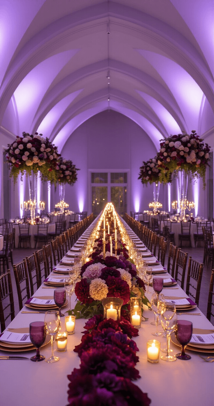
1. Burgundy, Plum, and Lilac — The Dark Romantic Trio
This one is chef’s kiss for evening weddings.
- Burgundy anchors the palette and gives it that deep, wine-soaked richness
- Plum bridges the gap between the two, sitting perfectly in the middle
- Lilac lifts the whole thing and stops it from feeling too heavy
The key with this trio is to use them in different proportions. Don’t split them equally across everything.
Pick one as your dominant shade — say, plum for bridesmaid dresses — and let burgundy and lilac live in your florals, stationery, and details.
Think candlelight. Think moody ceremony florals. Think photos that look like they belong in a fashion magazine.
This is also the combination that gives you that gorgeous ombré effect in bouquets — moving from deep burgundy at the base through plum and finishing in soft lilac at the top.
2. Burgundy, Deep Purple, and Blush — The Feminine Power Palette
This is probably the most versatile combination on this list.
Blush does something really clever here. It softens the intensity of the burgundy and purple without washing them out.
You keep the richness. You add the romance. You lose the heaviness.
This works exceptionally well for:
- Spring and summer weddings where you want warmth without weight
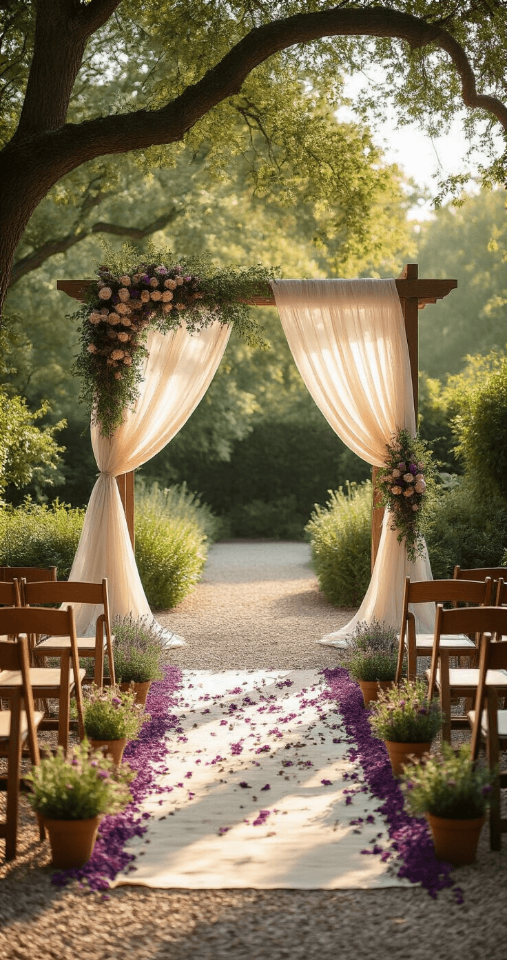
- Garden ceremonies where soft florals are everywhere
- Bridesmaid dresses and invitations where you want the color to feel fresh but still dramatic
If you’re worried the palette feels too dark or serious, blush is your answer every single time.
Save this article
Enter your email and we'll send it straight to your inbox.
3. Burgundy, Purple, and Gold — The Regal Combination
Let me be honest — this one is my personal favorite.
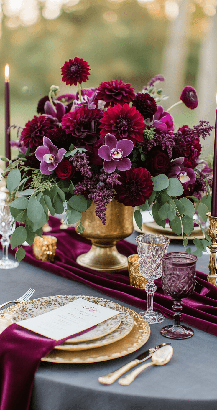
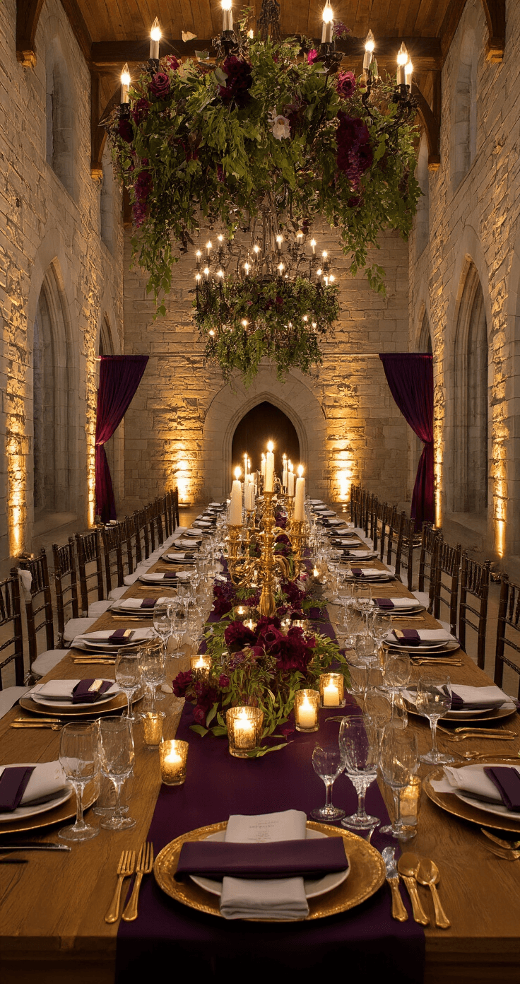
There is something about deep jewel tones paired with warm gold that feels genuinely luxurious. Like a candlelit dinner at a castle. Like royalty decided to throw a party and invited everyone.
The trick here is to use gold as an accent, not a dominant color.
- Gold candleholders on tables draped in deep purple and burgundy florals
- Gold-rimmed dinner plates against charcoal or ivory linens
- Gold cutlery and chargers that catch the candlelight
You want the gold to glow against those deep tones, not compete with them.
4. Burgundy, Lavender, and Ivory — The Garden Wedding Palette
If the previous combination is a candlelit castle, this one is a sun-drenched English garden.
Lavender brings that soft, romantic airiness. Ivory keeps everything grounded and elegant. Burgundy provides the definition and stops the palette from looking too pastel.
This is my go-to recommendation for:
- Outdoor and garden weddings
- Spring and early summer ceremonies
- Couples who want romance without drama
The ivory here does a lot of heavy lifting. It acts as a visual breath between the burgundy and lavender so nothing feels cramped or overwhelming.
Okay, this palette is for the couple who isn’t afraid to go dark.
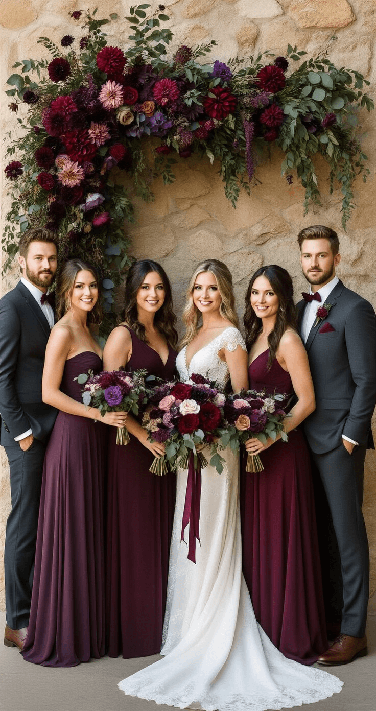
Deep purple and burgundy paired with navy or charcoal creates something genuinely dramatic and sophisticated. This is formal. This is evening. This is the palette where the groomsmen look incredible in charcoal or navy suits while the wedding party wears rich plums and burgundies.
Balance it with:
- Silver or gold metallics to prevent it from feeling somber
- Ivory or warm white in the linens to lighten the table setting
- Statement lighting — more on that below
6. Burgundy, Purple, and Sage or Emerald Green — The Nature-Inspired Palette
This one consistently surprises people.
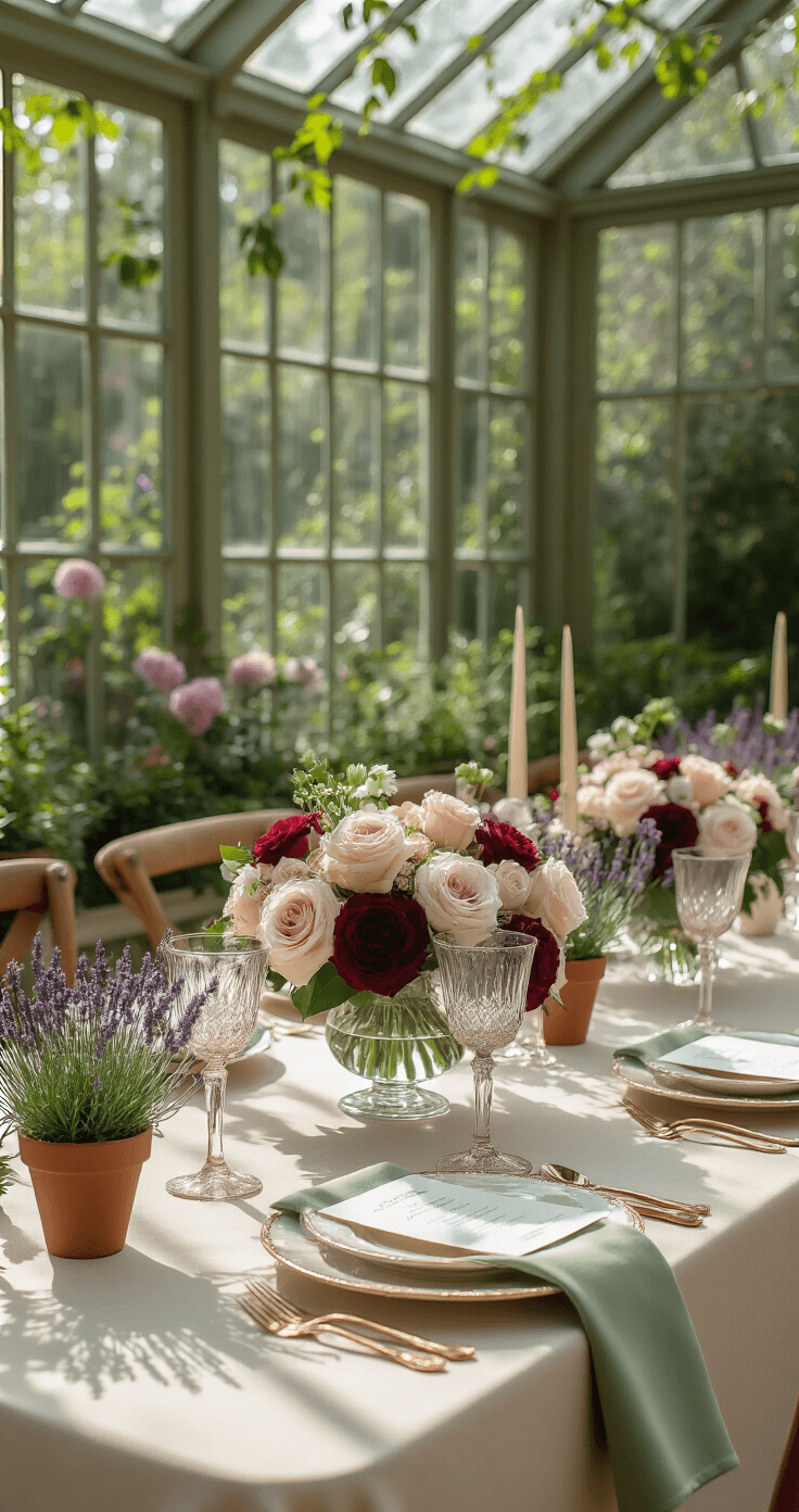
Green and burgundy is already a well-known gorgeous pairing — think of every beautiful fall wreath you’ve ever loved. Add deep purple or plum into that mix and it becomes something altogether more lush and complex.
- Sage green keeps it soft and organic
- Emerald green makes it dramatic and jewel-ton
Want to keep this one?
We'll email you the link so you can find it again later.