Mismatched Color Palette Dresses: The Ultimate Guide to Mixing Colors Like You Actually Know What You’re Doing
### What Exactly Are Mismatched Color Palette Dresses (And Why They Work)
A mismatched color palette dress look isn’t about throwing random colors together and hoping for the best. It’s about choosing colors that feel different but still make sense next to each other.
**Monochrome mismatch**: Different shades of the same color (navy, steel blue, powder blue — all blue, but not matchy-matchy)
**Analogous mismatch**: Colors sitting next to each other on the color wheel, like coral, salmon, and soft pink
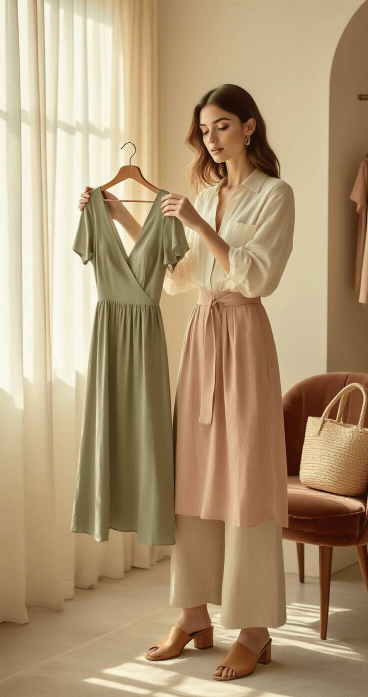
**Complementary mismatch**: Opposite colors on the color wheel, like sage green and blush pink, balanced out with softer tones
**Neutral-anchored mismatch**: Bold colors grounded by cream, taupe, beige, or charcoal
Each of these has its own vibe. **Monochrome** is the easiest to pull off. **Complementary** takes a little more confidence. But all of them, when done right, look incredibly intentional.
### How Hard Is This, Really? (Skill Levels Broken Down)
**Beginner Level**
– Stick to monochrome outfits
– Try classic black and white mismatch
– Layer neutrals on neutrals
– Analogous palettes are also great here
**Intermediate Level**
– Mix 2–3 colors in one outfit
– Try simple print mixing with solid dresses
– Use one neutral to tie two bolder colors together
**Advanced Level**
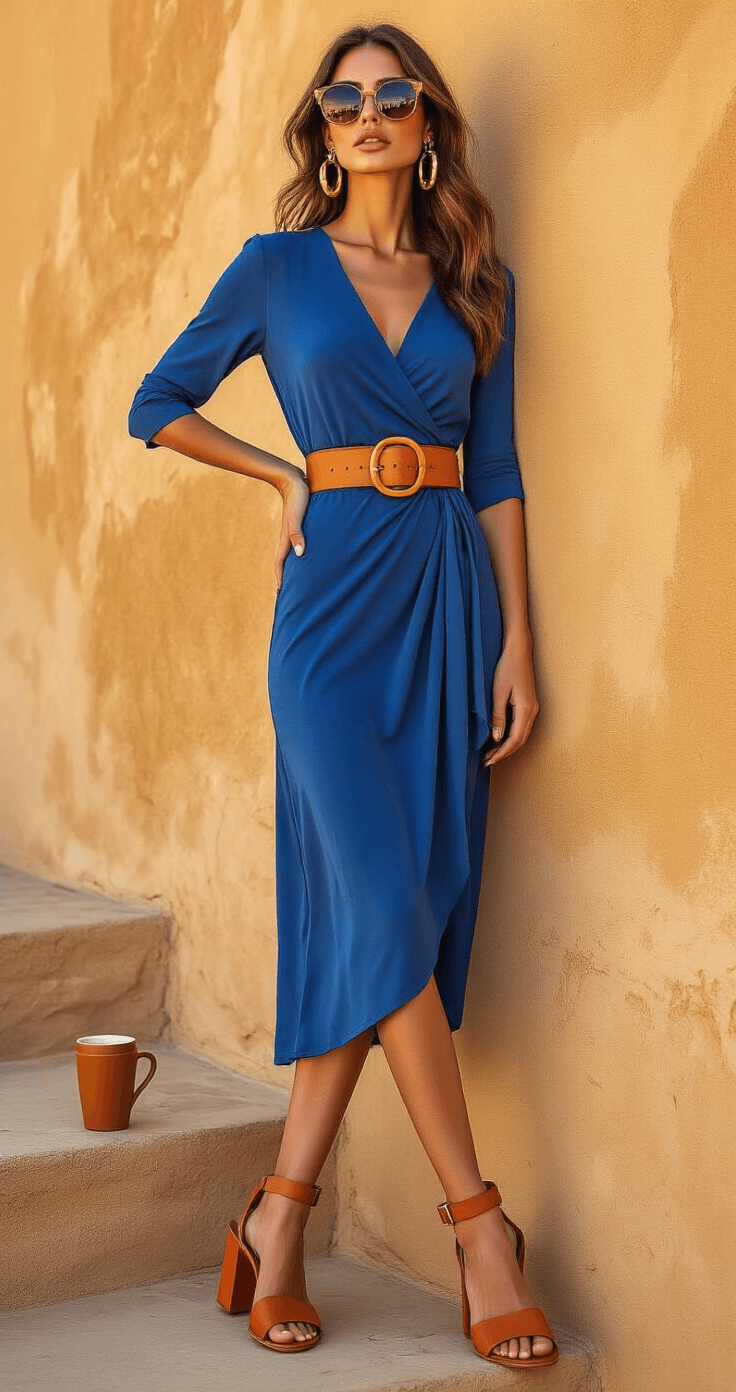
– Bold contrast colors like cobalt blue with terracotta
– Multiple prints layered together
– Complex looks with accessories playing into 3+ distinct colors
The key thing to remember at every level? One neutral or tonal anchor. Always.
### What You’ll Need Before You Start Styling
**The Dress Collection**
– Solid-color dresses in key shades: sage, blush, navy, rust, mustard, burgundy, champagne
– At least 2–3 neutral dresses: cream, taupe, charcoal, or soft white
– One or two statement dresses with prints, texture, or metallics
**Accessories That Tie It Together**
– Belts in neutral and accent colors
– A neutral tote bag that works across multiple palettes
– Simple gold or silver jewelry
– Shoes in neutrals — tan, white, black, and nude
**Styling Tools**
– A steamer
– Lint roller
– A few garment clips for adjusting fit during photos
– A portable garment rack to organize looks before you shoot
### Planning Your Mismatched Look: The Step-by-Step Process
**Step 1: Pick Your Palette Type**
Decide before you open your closet. Are you going monochrome today? Analogous? Complementary? Neutral-heavy? Choose one direction and stick to it.
**Step 2: Pull Your Main Dress First**
Start with the most important piece. Let’s say it’s a dusty rose midi dress. That’s your anchor.
**Step 3: Add a Supporting Color**
Choose one color that works next to your main piece. For dusty rose, you might go with:
– Warm terracotta (complementary, earthy)
– Soft sage green (complementary, fresh)
– Deeper mauve or wine (monochrome, tonal)
– Ivory or champagne (neutral-anchored)
**Step 4: Bring In Accessories**
Accessories should either match one of the two colors already in the look or be completely neutral.
Save this article
Enter your email and we'll send it straight to your inbox.
**Step 5: Do a Mirror Check**
Stand back and squint a little. If the colors all register at a similar visual “weight,” the look is working.
### The Role of Neutrals in Mismatched Color Palette Outfits
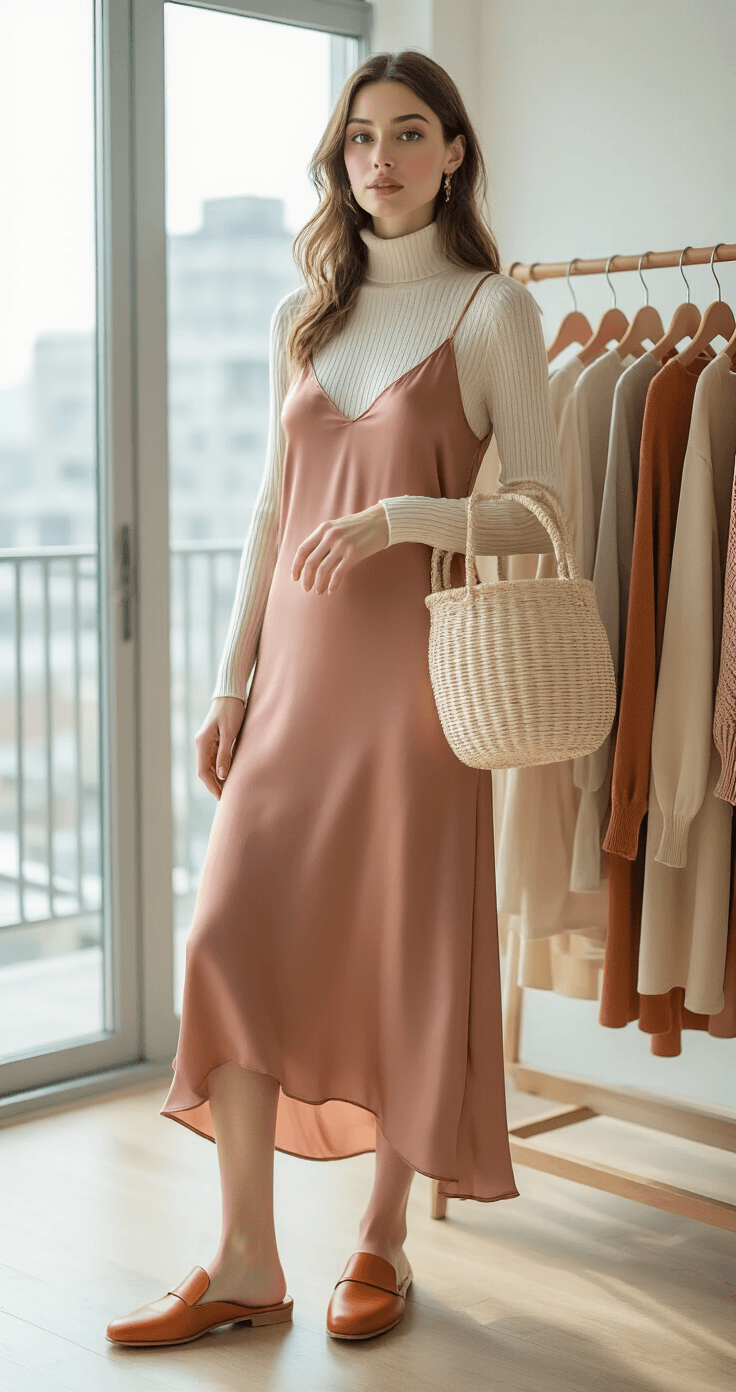
Neutrals are not boring. Neutrals are the glue. In any mismatched color palette dress outfit, neutrals do the heavy lifting of making everything look like it belongs together.
**The best neutrals for this**:
– **Black** — sharp, grounding, modern
– **White** — clean, fresh, very versatile
– **Beige and taupe** — warm, earthy
– **Gray** — cool and sleek
– **Champagne and cream** — soft and elevated
### Seasonal Mismatched Palettes (So You Always Know What Colors to Wear)
One of the easiest ways to build cohesive mismatched looks is to lean into seasonal color palettes.
**Spring and Summer**
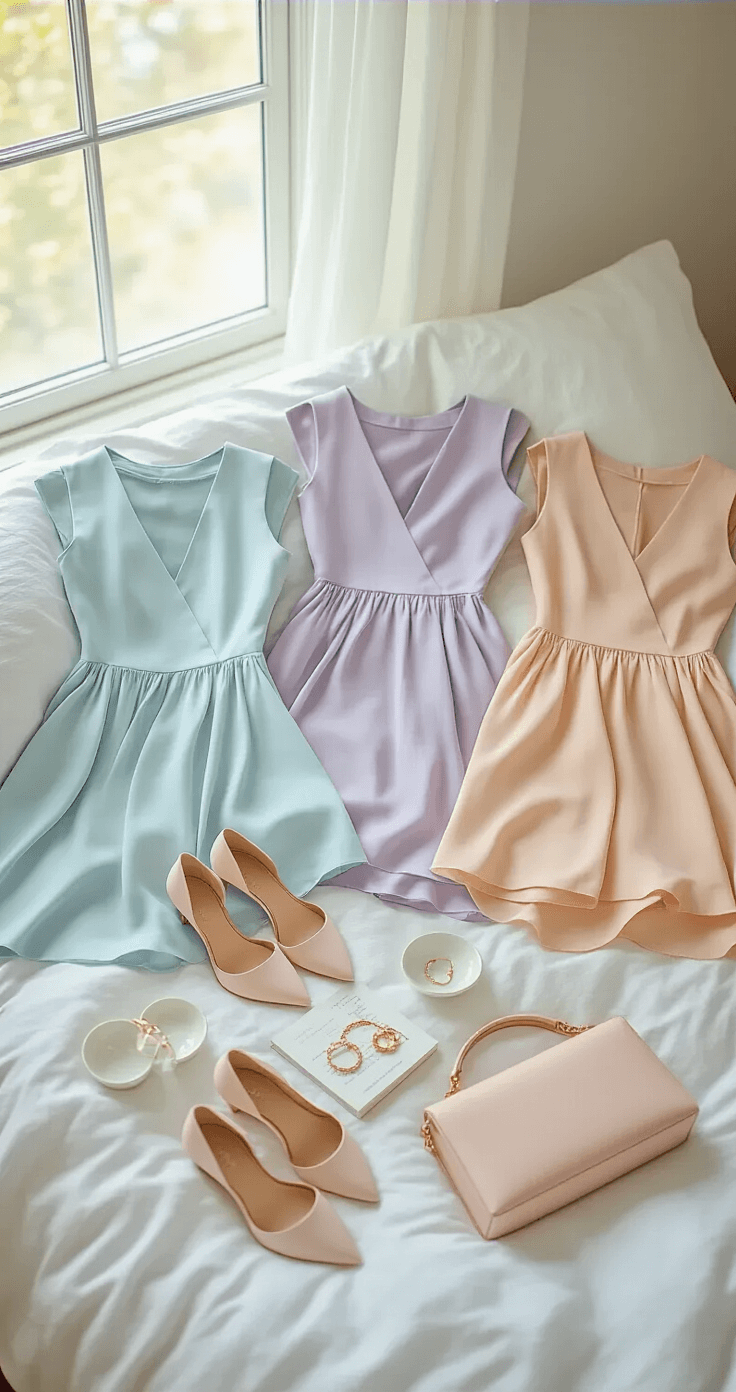
– Pastels: ice blue, soft pink, lavender, mint
– Warmer tones: coral, peach, sunshine yellow
– Bright accents grounded by white or cream
**Fall**
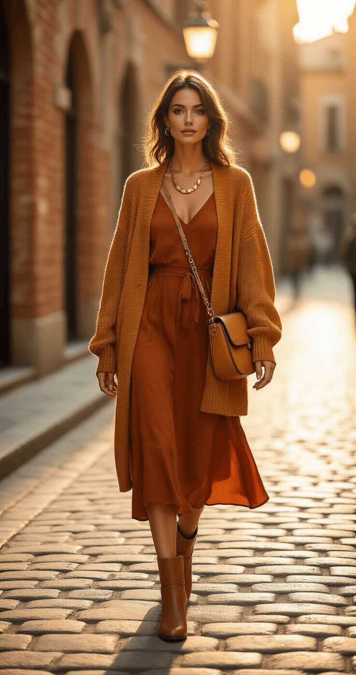
– Rust, terracotta, mustard, camel
– Olive green, forest green, warm brown
– Burgundy and wine mixed with earthy neutrals
**Winter**
– Jewel tones: wine, mulberry, plum, deep navy
– Rich emerald and forest green
– Moody palettes with charcoal, black, and deep berry
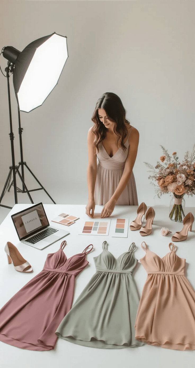
### How to Use Color Theory Without Going Back to Art School
**Undertones Are Everything**
Every color has a warm or cool undertone. When you mix colors, try to keep undertones consistent. Warm with warm. Cool with cool.
**Saturation Matters Too**
Saturation is basically how intense or muted a color is. Try to match saturation levels — muted with muted, bold with bold — and your mismatched looks will always feel balanced.

### Shooting Your Mismatched Dress Outfits (For Content Creators and Fashion Lovers)
**Your Equipment**
You don’t need a fancy camera to start. A modern smartphone with portrait mode is totally enough.
**Lighting Setup**
Lighting is genuinely make or break when it comes to color accuracy. Options that work:
– Natural light from a north-facing window
– Golden hour for outdoor shots
– Softbox
Want to keep this one?
We'll email you the link so you can find it again later.