Wedding Color Schemes: The Only Guide You Need to Plan a Palette You’ll Love Forever
Wedding Color Schemes: The Only Guide You Need to Plan a Palette You’ll Love Forever
Wedding color schemes can make or break the look of your entire day.
I know that sounds dramatic, but think about it — every photo, every flower, every table linen, every bridesmaid dress, every candle… it all lives or dies by the colors you choose.
And yet most couples I’ve spoken to start this process completely overwhelmed.
They’ve saved 47 pins on Pinterest. They love blush and terracotta and dusty blue. They have no idea how to actually turn that chaos into something cohesive.
If that’s you — you’re in exactly the right place.
I’ve pulled together everything you need to know, from the basic structure of a palette all the way to specific trending combinations for 2026, broken down by season, venue, and vibe.
Let’s make this simple.
What a Wedding Color Scheme Actually Is (and Why It Matters More Than You Think)
A wedding color scheme is a coordinated palette of 2–5 colors that runs through everything — your decor, attire, florals, and stationery.
When it’s done right, your wedding photos look like they belong in a magazine.
When it’s done wrong, things feel…off. Not terrible, just…off. Like a room where the furniture doesn’t quite match.
The good news? You don’t need a design degree to get this right. You just need a simple structure and a clear starting point.
How to Structure a Wedding Color Scheme So Everything Looks Cohesive
Here’s the formula most professional wedding planners use, and honestly, it works every single time.
Step 1: Pick 1–2 main colors.
These are your dominant hues. They’ll show up in your florals, your linens, your bridesmaid dresses — the big visual moments.
Step 2: Add 1–2 secondary colors, including at least one neutral.
Think ivory, white, taupe, gray, or black. Neutrals are the quiet heroes of any great palette. They give your eye somewhere to rest.
Step 3: Finish with one metallic or accent shade.
Gold, silver, copper, rose gold, champagne. Use this sparingly — it’s a garnish, not the main dish.
The 60/30/10 Rule (Your Best Friend for a Balanced Palette)
This is a proportion guideline borrowed straight from interior design, and it works beautifully for weddings:
- 60% — your dominant color (linens, big floral arrangements, bridesmaid dresses)
- 30% — your secondary color (smaller decor elements, stationery, accent florals)
- 10% — your metallic or accent shade (gold candle holders, cutlery, picture frames, cake details)
Think of it as anchor + complement + accent.
That’s the whole formula. Nail those three layers and your wedding will look intentional, photogenic, and put-together — without you having to obsess over every single detail.
Classic Wedding Color Schemes That Never Go Out of Style
Before we get into what’s trending, let’s talk about the palettes that have stood the test of time.
These work across almost any venue, any season, and they photograph beautifully.
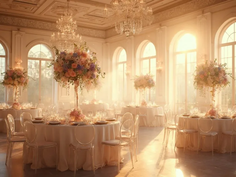
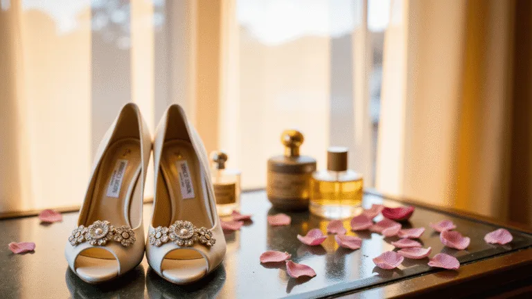
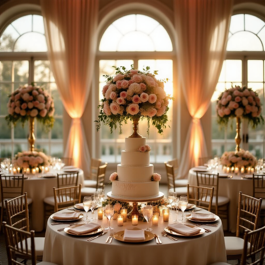
Blush Pink + Ivory + Gold
This is the romantic classic. Soft, feminine, and incredibly popular for good reason.
- Blush shows up in florals and bridesmaid dresses
- Ivory linens keep the base clean and warm
- Gold in the cutlery, taper candle holders, and small decor details
It’s the wedding palette equivalent of a white button-down shirt — it just works.
Green + White
Clean, elegant, and endlessly sophisticated.
This one leans heavily on abundant greenery — eucalyptus, ferns, lush tropical leaves — paired with white florals and neutral linens.
Save this article
Enter your email and we'll send it straight to your inbox.
It’s ideal for garden weddings and modern ceremonies that want to feel fresh without being fussy.
A longstanding favorite for formal events.
If you’re getting married in a ballroom, a coastal venue, or anywhere with a slightly traditional feel — this palette delivers every single time.
Black + White (with Optional Metallic)
Minimalist, modern, and genuinely chic.
Add gold and it becomes glamorous. Add silver and it becomes editorial. Leave the metallics out entirely and it becomes architecturally striking.
Lavender + Cream + Silver
Airy, romantic, and perfect for vineyard or estate weddings.
There’s something about lavender and silver together that feels like early evening light — soft, a little dreamy, completely beautiful.
Trending Wedding Color Schemes for 2026 (What’s Actually Popular Right Now)
Here’s where things get exciting.
The trend in 2026 is moving away from overly safe neutrals and toward layered, expressive color.
Couples want personality. They want visual storytelling. They want their wedding to feel like them.
Here are the combinations leading that charge:
Sage Green + Blush Pink + Cream
This is the single most popular combination heading into 2026.
And I get it. It’s soft without being boring. It’s romantic without being over-the-top. It works indoors, outdoors, in spring, in fall — it’s genuinely one of the most versatile palettes you can choose.
Pair it with dried pampas grass arrangements and you’ve got something that looks effortlessly styled.
Dusty Blue + Soft White (or Peach)
Fresh, light, and incredibly photogenic.
This palette works especially well for coastal weddings, outdoor ceremonies, or airy ballroom settings.
The key is keeping the blue dusty — muted and soft, not bright or bold.
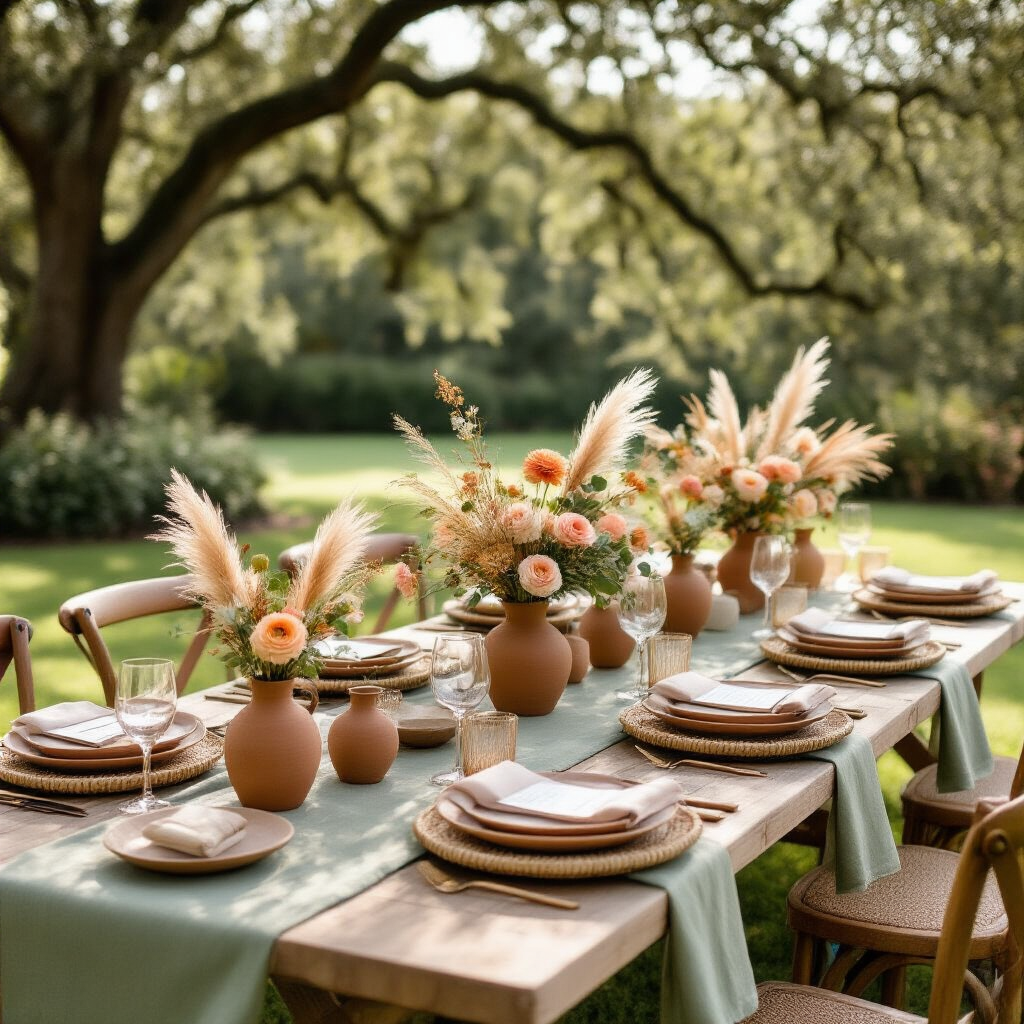
Terracotta + Sage + Cream
Warm. Earthy. Grounded.
This one has “rustic Mediterranean wedding” written all over it, but it also works beautifully for fall celebrations.
It’s the palette you choose when you want your wedding to feel like a long, golden afternoon.
Mocha Neutrals + Dusty Mauve + Champagne/Rose Gold
This is the sophisticated option.
Sometimes called the “mocha mousse” aesthetic, this palette feels mature, warm, and genuinely current.
Think warm beige table runners, dusty mauve florals, and champagne glassware that catches the candlelight.
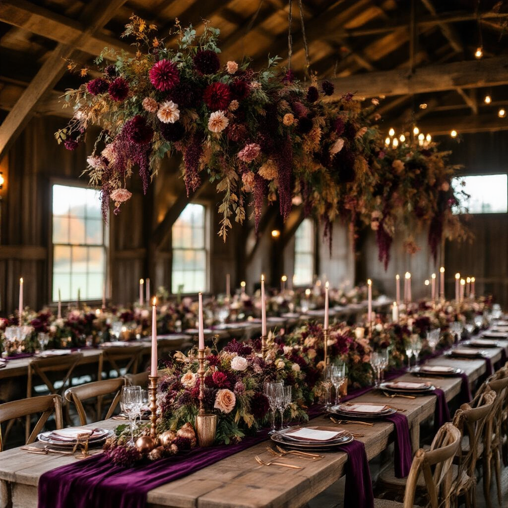
Deep Plum + Burgundy + Rose Gold
Moody,
Want to keep this one?
We'll email you the link so you can find it again later.