

Summer Wedding Color Palettes That’ll Make Your Big Day Absolutely Stunning
Why Summer Wedding Colors Actually Matter More Than You Think
Contents
Your color palette isn’t just about pretty tablecloths.
It sets the emotional tone for your entire day. It shows up in every single photo your guests will see for decades. It influences how comfortable your bridesmaids feel, how cohesive your decor looks, and whether Aunt Martha compliments your “vision” or whispers about your “interesting choices.”
Summer gives you permission to play with color in ways winter weddings simply can’t pull off. Natural light is your best friend. Outdoor venues come alive. Florals are abundant and affordable.
Let’s make the most of it.
Soft & Romantic: For Couples Who Want Timeless Elegance
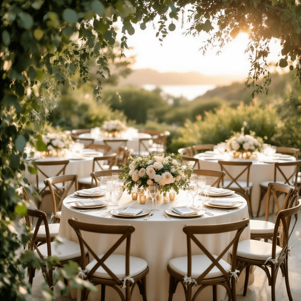
Blush, Ivory, and Sage Green
This combination is having a major moment, and for good reason.
I used this palette for my best friend’s garden wedding last summer, and the photos still make me tear up. The sage green added just enough depth to prevent the blush from feeling too sweet or juvenile.
Here’s how to make it work:
- Use ivory table linens as your neutral base
- Add sage green through eucalyptus garlands, bridesmaid dresses, or napkins
- Bring in blush through roses, peonies, and ranunculus arrangements
- Light matters: This palette absolutely glows during golden hour
The ivory keeps everything grounded while the blush and sage create that dreamy, garden-party vibe everyone secretly wants.

Powder Blue and Blush
Think cotton candy skies at sunset.
This pairing feels fresh without being childish, romantic without being overly precious. It works particularly well for morning or early afternoon ceremonies when natural light is softer.
Implementation tips:
- Powder blue works beautifully in bridesmaid dresses
- Use blush for florals and table runners
- Add white or cream as a third neutral to prevent it from feeling too pastel-heavy
- Pro tip: This palette photographs incredibly well against natural outdoor backdrops
Butter Yellow and Pale Lilac
This unexpected combination feels like a European countryside wedding.
Butter yellow (not neon, not sunshine—think warm, creamy yellow) paired with soft lilac creates sophistication with a playful edge.
The key is keeping both colors muted:
- Avoid bright school-bus yellow at all costs
- Keep lilac on the paler side to maintain elegance
- Bring in cream-colored candles for evening receptions
- Use greenery liberally to ground these lighter tones
This works especially well for evening receptions when the lighting is dimmer and warmer tones photograph beautifully.
Bold & Vibrant: For Couples Who Aren’t Afraid of Color
Coral, Fuchsia, and Tangerine
This is not for the faint of heart, but my goodness, when it’s done well, it’s spectacular.
I attended a beach wedding in Mexico with this palette, and it felt like the whole celebration was bursting with joy. The bride told me later she was terrified it would be “too much,” but everyone still talks about how memorable and unique it was.
Making bold colors work requires confidence:
- Balance is everything: Use white or cream linens to give the eyes a resting place
- Incorporate these colors through florals like ranunculus, dahlias, and tropical blooms
- Consider coral table runners instead of full tablecloths
- Add tangerie through cocktails, signature drinks, or citrus garnishes
This palette absolutely demands natural light. Indoor receptions with warm lighting can make these colors look muddy. If you’re set on this combination, choose a venue with floor-to-ceiling windows or plan for an outdoor celebration.
Mint Green and Coral (or Peach)
The 2014 throwback is officially back, and it’s better than ever.
What makes it work now versus a decade ago is the sophistication in how we’re using it. We’re talking muted mint, not toothpaste. Peachy coral, not traffic-cone orange.
Implementation strategy:
- Use mint sparingly as an accent color
- Let coral or peach dominate through florals and bridesmaid dresses
- Add gold or brass metallic accents to elevate the palette
- Critical point: Natural outdoor backdrops make this combination shine
The mint provides cooling relief in summer heat while coral keeps things warm and inviting.
Juicy Cherry Red with Cream and Copper
Red at a wedding? Absolutely.
Done right, cherry red feels romantic, passionate, and surprisingly sophisticated. The key is pairing it with cream (not white) and warm metallics like copper or rose gold.
How to pull this off:
- Use red in florals—roses, ranunculus, and dahlias work beautifully
- Incorporate cream through linens, candles, and neutral florals
- Add copper through table numbers, flatware, or votive holders
- Keep it balanced: Too much red overwhelms; use the 60-30-10 rule (60% cream, 30% red, 10% copper)
This palette photographs incredibly well and creates a bold statement without feeling theme-y or costumey.
Classic & Sophisticated: For Couples Who Love Timeless Style
This is elegance personified.
Navy grounds everything, dusty blue adds softness, and champagne brings in just enough sparkle without being flashy. I’ve seen this work in both upscale ballrooms and rustic barns—it’s that versatile.
The secret to making it work:
- Use navy as your smallest color presence (groomsmen suits, napkins, invitation accents)
- Let dusty blue dominate through bridesmaid dresses and linens
- Bring in champagne through metallics, lighting, and neutral florals
- Add white florals like roses, hydrangeas, and delphinium
This palette works year-round but truly shines in summer when natural light makes the blues look crisp and fresh rather than heavy.


")


