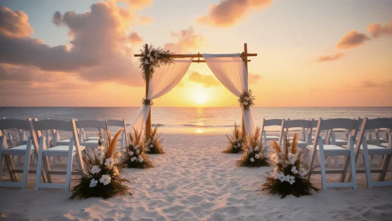
Red and White Wedding: The Complete Guide to a Bold, Romantic Palette That Actually Works
Red and White Wedding: The Complete Guide to a Bold, Romantic Palette That Actually Works
A red and white wedding is one of the most striking color combinations you can choose — and also one of the easiest to get completely wrong.
Too much red and it feels like Valentine’s Day at a steakhouse. Too little and the whole point disappears.
I’ve seen this palette done beautifully and I’ve seen it crash hard, and the difference almost always comes down to three things: proportion, consistency, and a good bridging neutral.
So if you’re planning a red and white wedding and you’re not sure where to start — or you’ve started and something feels “off” — this guide is for you.
We’re going to cover everything. From the exact ratio of red to white, to florals, to tablescapes, to what time of year this palette actually shines.
Let’s get into it.
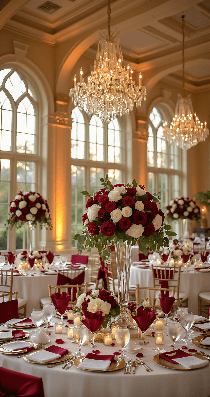
What Makes Red and White Work (And What Makes It Fall Apart)
Here’s the honest truth most wedding blogs won’t tell you:
Red and white is a high-stakes palette.
It’s bold, it’s romantic, it photographs like a dream — but it has zero tolerance for inconsistency.
If you mix a bright cherry red napkin with a burgundy centerpiece and a crimson ribbon on the chair, it looks like a mistake. Not a design choice. A mistake.
The couples who nail this look do one thing religiously:
They pick one shade of red and commit to it everywhere.
That’s it. That’s the whole secret.
Whether you go crimson, cherry, burgundy, or oxblood — decide, then stick to it across every single element. Florals, textiles, stationery, candles, ribbon. Every. Single. One.
The Red and White Wedding Color Formula
Think of this palette in three layers:
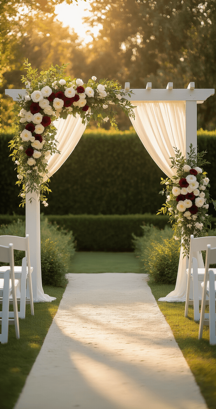
- White is the foundation — the dominant color, covering 60–65% of your visual space
- Red is the statement — bold and intentional, sitting at around 30–35% of the visual space
- A neutral is the bridge — gold, silver, black, or greenery that connects the two without competing
That bridging neutral is the piece most people forget. Without it, red and white can feel harsh and flat — like a graphic design project rather than a romantic wedding.
Gold adds warmth and luxury. Silver adds sleekness and modernity. Black adds drama and edge. Greenery adds softness and a natural, organic feel.
Pick one and use it consistently as an accent. Not a main color — just an accent.
Save this article
Enter your email and we'll send it straight to your inbox.
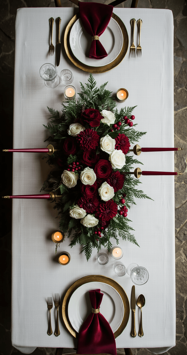
Is a Red and White Wedding Right for You?
Ask yourself these questions:
- Do you want your wedding photos to feel bold and dramatic rather than soft and dreamy?
- Are you drawn to classic romance — roses, candlelight, and rich textures?
- Do you want a palette that works across all seasons, especially fall and winter?
- Are you willing to be disciplined about color consistency?
If you answered yes to most of those — this palette was made for you.
This look works especially well for:
- Fall and winter weddings with deeper reds like cranberry or burgundy
- Holiday weddings — Christmas, New Year’s, Valentine’s Day
- Formal indoor receptions with high ceilings, drapes, and candlelight
- Classic or luxurious themes where drama is the whole point
It also works in spring and summer — just shift toward lighter reds, more greenery, and cleaner, airier textures.
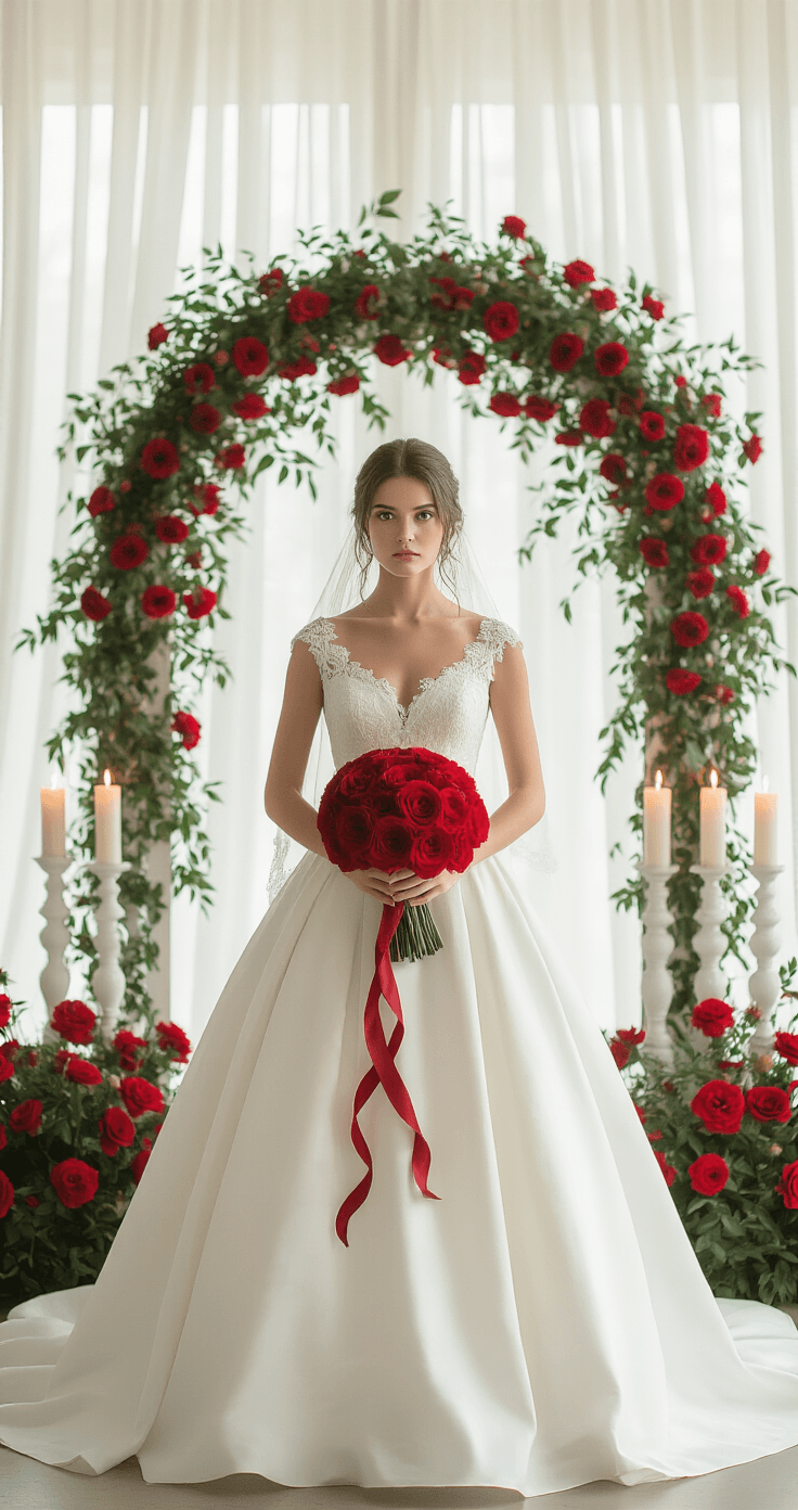
The Red and White Wedding Florals That Actually Look Good
Florals are where this palette lives or dies.
Here’s what works:
Red florals that photograph beautifully:
- Red roses (classic, always works)
- Red dahlias (dramatic, incredible texture)
- Red ranunculus (softer, more romantic)
- Red carnations (budget-friendly and underrated)
- Red anthuriums (modern and striking)
- Red anemones (delicate contrast against white)
White florals to pair with them:
- White garden roses
- White peonies (for spring and early summer)
- White orchids
- White lilies
- White ranunculus
Greenery to soften the palette:
- Eucalyptus (loose and natural)
- Ruscus (structured and elegant)
- Ivy (trailing and romantic)
I personally think the biggest mistake people make with red and white florals is going too matchy-matchy — a perfectly arranged bouquet of equal red and white roses looks stiff.
Instead, let the white dominate the arrangement and use red as the accent even within the florals themselves. A bouquet that’s 70% white blooms with splashes of deep red ranunculus and loose greenery looks infinitely more sophisticated than a 50/50 split.
A great starting point is a red and white wedding bouquet if you want something pre-arranged or need inspiration for your florist.
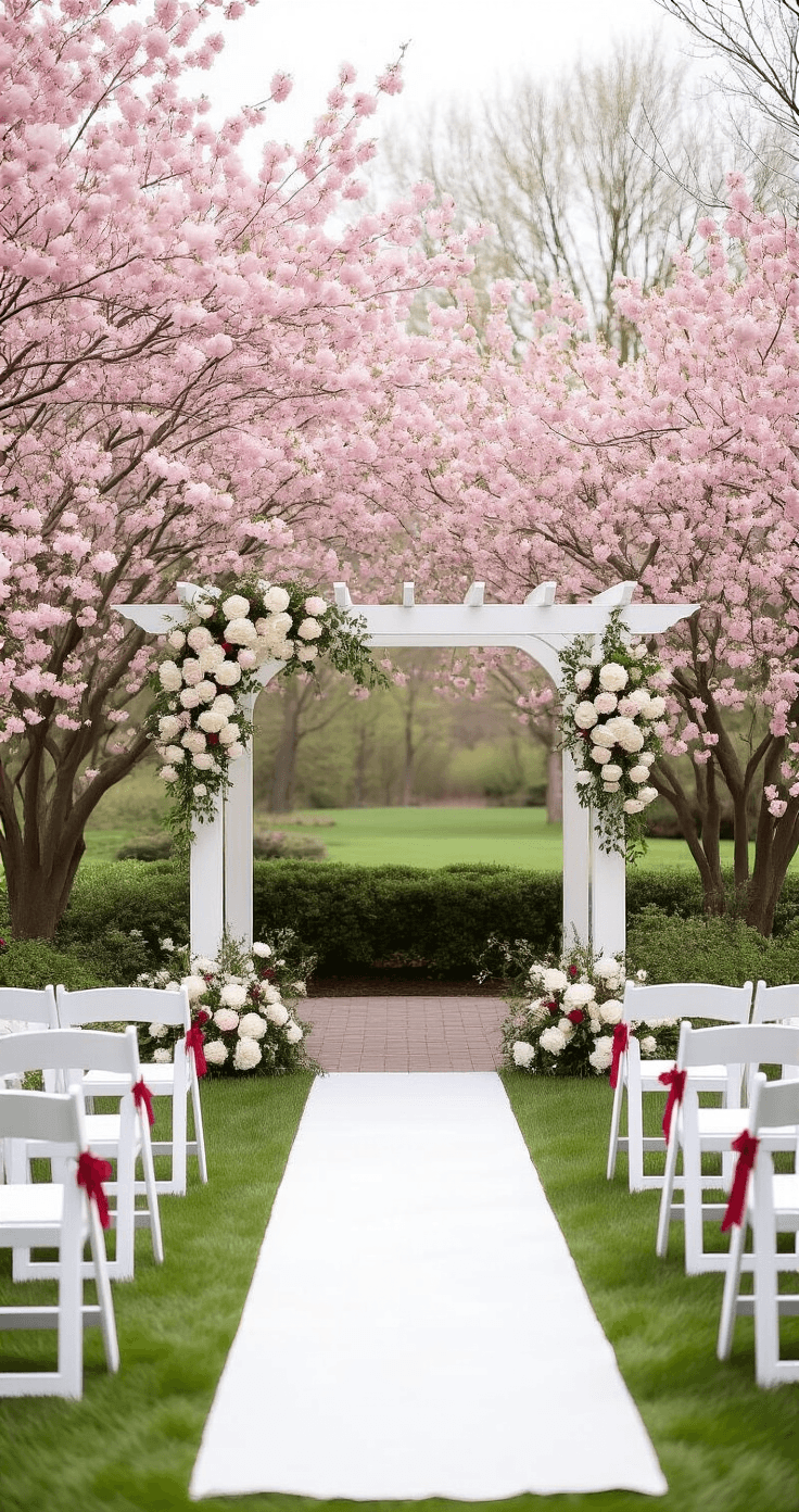
Red and White Wedding Ceremony Setup: What You Actually Need
The ceremony arch is your biggest visual statement.
Get this right and everything else falls into place.
Here’s how to style a ceremony arch for a red and white wedding:
-
Want to keep this one?
We'll email you the link so you can find it again later.