

Why Your “White” Paint Choice Actually Matters More Than You Think
Ivory vs White in Home Decor
Contents
- Ivory vs White in Home Decor
- Why Your “White” Paint Choice Actually Matters More Than You Think
- The Lighting Disaster I Almost Made (And How You Can Avoid It)
- Which Color Plays Nice With Your Existing Furniture?
- The Fabric and Texture Game-Changer
- The Psychology Behind Your Color Choice (Yes, It’s Real)
- Common Mistakes That’ll Make You Want to Repaint Everything
**Ivory vs white in home decor has been driving me absolutely mad lately, and I bet you’re scratching your head about it too.**
You’re standing in the paint aisle, swatches in hand, wondering why there are seventeen different shades of what looks like the same color. Your partner thinks you’ve lost your mind for obsessing over “basically white” for three hours. Trust me, I’ve been there.
The difference between ivory and white isn’t just some designer nonsense meant to empty your wallet. These colors can make or break your entire room’s vibe.
Why Your “White” Paint Choice Actually Matters More Than You Think
Last month, I painted my living room what I thought was a gorgeous crisp white. Under the store’s fluorescent lights, it looked perfect. At home, it turned my cozy space into something that screamed “sterile dentist office.”
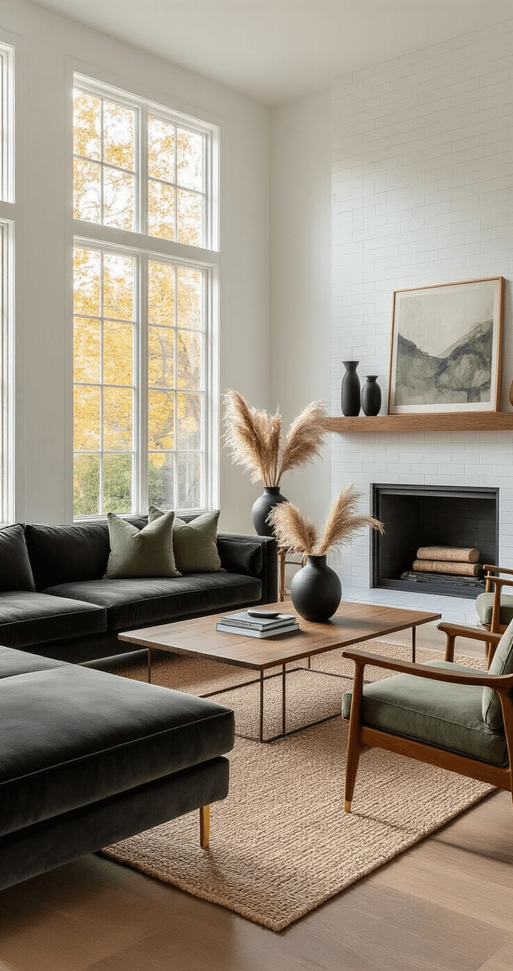
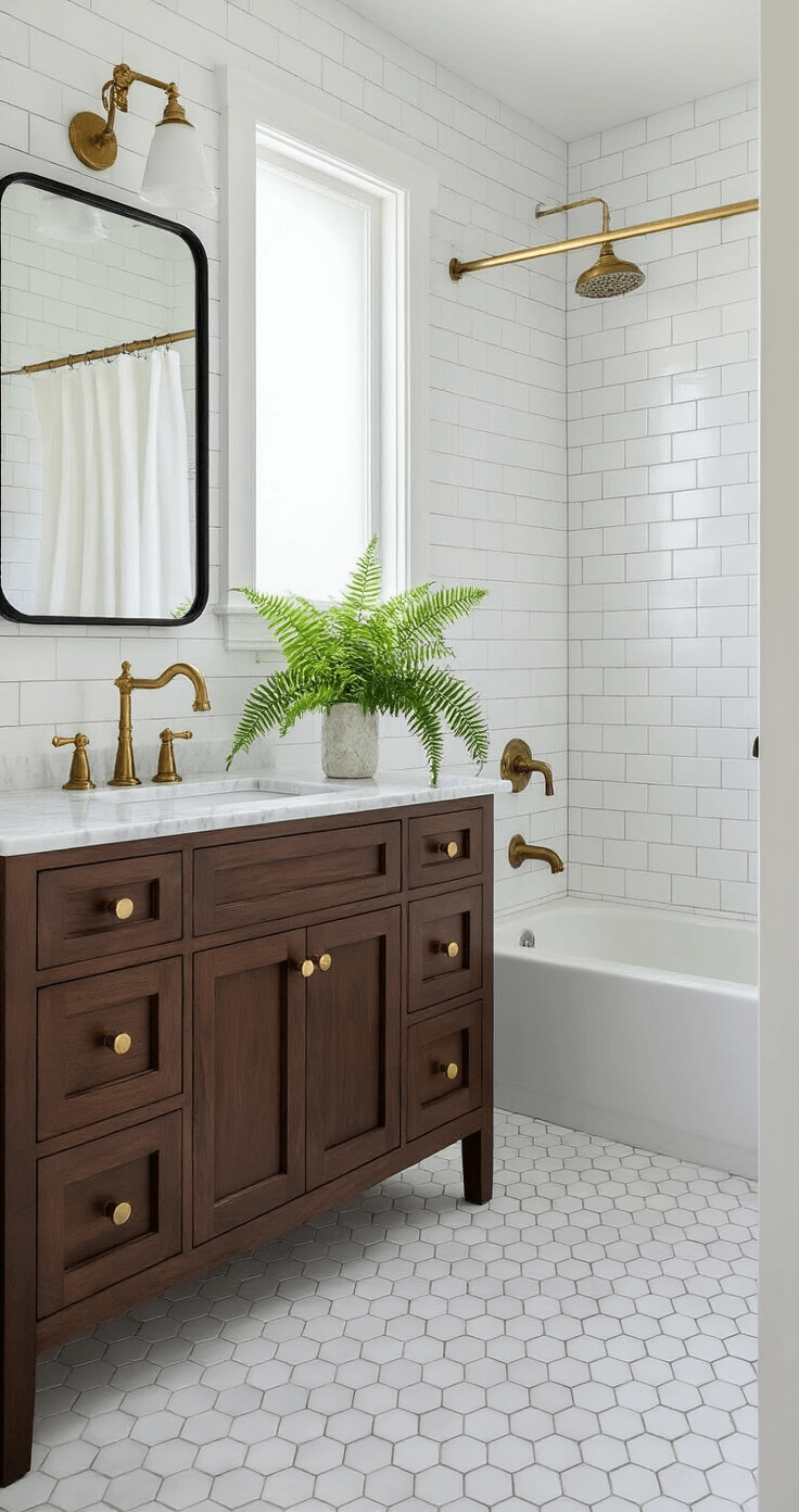
White is the Beyoncé of colors—bold, attention-grabbing, and impossible to ignore. It’s pure, bright, and reflects light like nobody’s business. Think fresh snow or that perfect white t-shirt you can never keep clean.
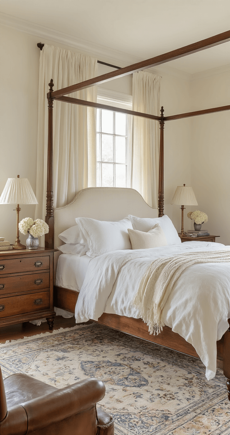
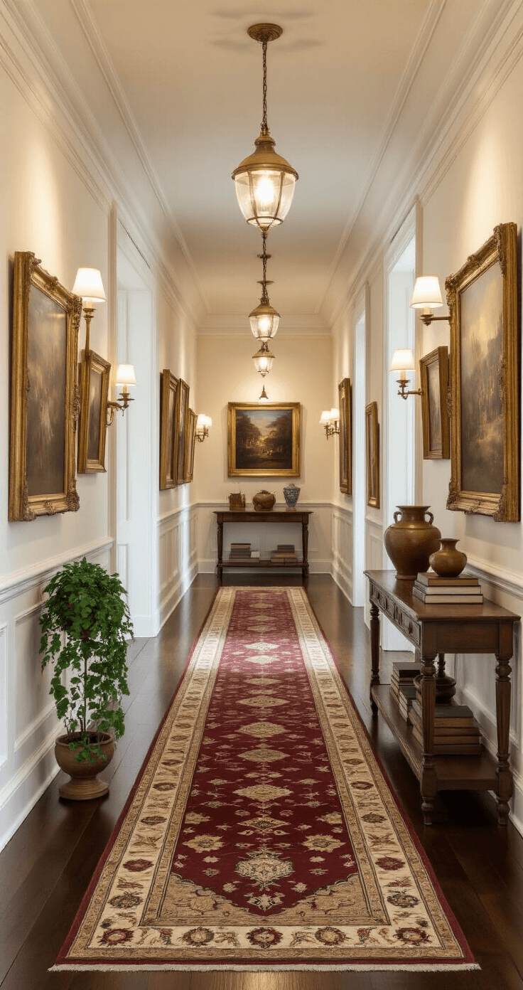
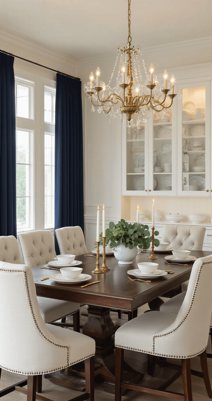
Ivory is white’s sophisticated older sister. She’s got those warm, creamy undertones that whisper instead of shout. Picture vintage lace, aged pearls, or your grandmother’s cherished china set.
The Lighting Disaster I Almost Made (And How You Can Avoid It)
Here’s where things get tricky, and where I learned my lesson the hard way.
Your room’s lighting will completely change how these colors behave:
- North-facing rooms love ivory because they get cooler, bluer light that can make pure white feel arctic
- South-facing spaces can handle white beautifully since they’re flooded with warm, golden light
- Artificial lighting makes white appear more yellow, while ivory can look muddy under harsh fluorescents
- Evening lighting transforms white into a cozy cream, but ivory might disappear entirely
I recommend grabbing some paint sample sheets and taping them to different walls throughout the day. Watch how they change from morning coffee to evening wine time.
Which Color Plays Nice With Your Existing Furniture?
Your sofa doesn’t care about your Pinterest dreams—it’s going to clash if you’re not careful.
White works beautifully when you want:
- Modern, minimalist vibes
- Bold artwork to pop off the walls
- Crisp contrast with dark furniture
- That fresh, clean aesthetic that screams “I have my life together”
Ivory is your best friend for:
- Vintage or antique pieces that need warmth
- Creating cozy, lived-in spaces
- Softening harsh architectural lines
- Making guests feel like they’re in a boutique hotel instead of a showroom
I paired ivory walls with my vintage brass picture frames, and suddenly my hallway gallery looked intentionally curated instead of randomly assembled.
The Fabric and Texture Game-Changer
This is where things get really interesting, and most people miss this completely.
Your fabric choices will either enhance or fight your wall color:
- Matte fabrics like linen and cotton make white look crisp and clean
- Shiny materials such as silk or satin bring out ivory’s creamy undertones beautifully
- Textured weaves add depth to both colors but work especially well with ivory’s subtle warmth
My linen curtains looked stunning against white walls, but when I switched to ivory, they needed silk tie-backs to maintain that elevated look.
The Psychology Behind Your Color Choice (Yes, It’s Real)
Colors mess with our brains more than we realize.
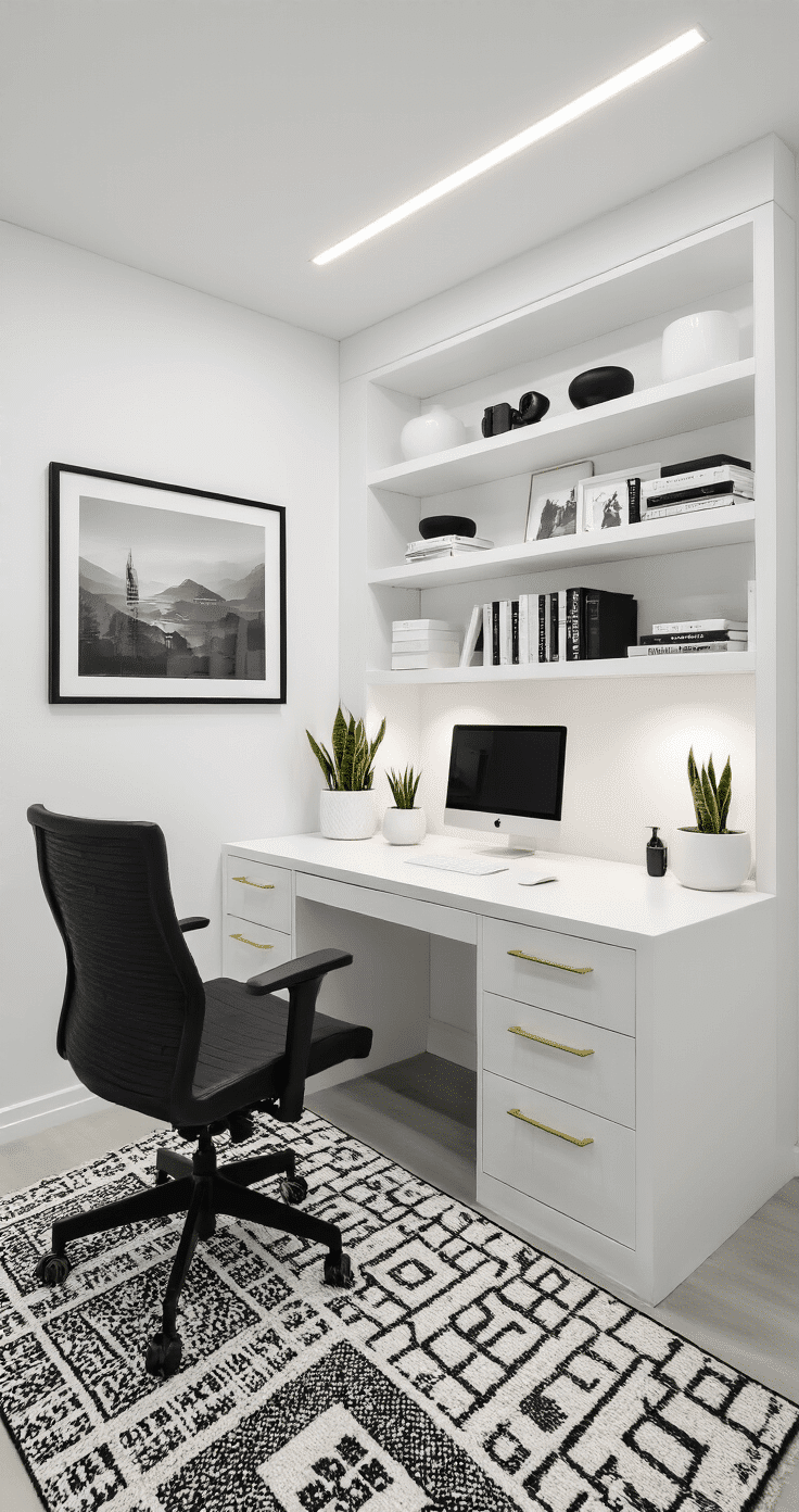
White triggers feelings of:
- Cleanliness and organization
- Spaciousness and airiness
- Modern sophistication
- Sometimes coldness or sterility if overdone
Ivory creates sensations of:
- Warmth and comfort
- Timeless elegance
- Relaxation and calm
- Subtle luxury without showiness
I noticed my productivity actually increased in my white home office, but my bedroom needed ivory to feel restful instead of clinical.
Common Mistakes That’ll Make You Want to Repaint Everything
The “All White Everything” trap: Pure white walls, white furniture, white accessories = bland Instagram photo waiting to happen. Add texture, warmth, or bold accents to avoid looking like a fancy padded room.
The “Ivory Overload” problem: Too much ivory can make spaces feel dingy or dated, especially in small rooms with limited natural light. Balance it with crisp whites in trim or accessories.
Ignoring your home’s architectural style: Your 1970s ranch house might rebel against ultra-modern white, while your contemporary loft could make ivory look out of place.

Post navigation
Similar Posts
Transform Your Christmas Tree from Basic to Breathtaking with the Perfect Tree Garlands
Transform Your Christmas Tree from Basic to Breathtaking with the Perfect Tree GarlandsContentsTransform Your Christmas Tree from Basic to Breathtaking with the Perfect Tree GarlandsWhat…
The Game-Changing Outdoor Wedding Entrance That’s About to Transform Your Big Day
Why Most Wedding Entrance Ideas Fall Flat (And What Actually Works)ContentsWhy Most Wedding Entrance Ideas Fall Flat (And What Actually Works)The 5-Piece Solution That’s Revolutionizing…
Creating the Perfect Spiderman Balloon Garland That’ll Make Your Party Legendary
Why Your Current Party Decor Isn’t Cutting ItContentsWhy Your Current Party Decor Isn’t Cutting ItThe Magic Behind Spiderman Balloon GarlandsEssential Supplies for Your Spiderman Balloon…
How I Finally Nailed My Wedding Guest List (Without Losing My Mind or My Budget)
How I Finally Nailed My Wedding Guest List (Without Losing My Mind or My Budget)ContentsHow I Finally Nailed My Wedding Guest List (Without Losing My…
Your Ultimate Guide to Day-of Wedding Coordination: Making Your Big Day Seamless
Your Ultimate Guide to Day-of Wedding Coordination: Making Your Big Day SeamlessContentsYour Ultimate Guide to Day-of Wedding Coordination: Making Your Big Day SeamlessWhat Exactly is…
10 Stunning Backyard Wedding Theme Ideas to Transform Your Outdoor Celebration
10 Stunning Backyard Wedding Theme Ideas to Transform Your Outdoor CelebrationContents10 Stunning Backyard Wedding Theme Ideas to Transform Your Outdoor CelebrationWhy Backyard Weddings Are the…


