Winter Wedding Colors That’ll Make Your Guests Actually Gasp
Winter Wedding Colors That’ll Make Your Guests Actually Gasp
Contents
- Winter Wedding Colors That’ll Make Your Guests Actually Gasp
- The Winter Wedding Color Reality Nobody Talks About
- Jewel Tones: The Winter MVP You Can’t Mess Up
- Moody Romance: Burgundy, Maroon, and Their Gorgeous Friends
- Ice Queen Elegance: Cool Tones That Actually Work
- Unexpected Warmth: Palettes That Break Winter Wedding Rules
- The Metallics That Make Everything Better
- Month-by-Month Winter Palette Strategy
Winter wedding colors need to do more than just “look nice”—they need to transform your venue into something unforgettable.
I’ve seen couples stress for months over whether their color palette will photograph well, clash with the venue, or feel too Christmassy when they’re getting married in February.
Let me save you that headache.
After years of watching winter weddings come together (and occasionally fall apart because someone chose the wrong shade of blue), I’ve learned what actually works when temperatures drop and you want your celebration to feel magical instead of generic.
The Winter Wedding Color Reality Nobody Talks About
Here’s the thing about winter weddings.
Natural light disappears by 5 PM.
Your venue lighting will dramatically change how every color appears in photos.
That “dusty blue” you loved on Pinterest might look completely washed out under warm amber uplighting, while deep jewel tones suddenly become the heroes that photograph beautifully in low light.
I learned this the hard way when I chose pale pastels for a January wedding and ended up with photos that looked like someone had drained all the color from the room.
Jewel Tones: The Winter MVP You Can’t Mess Up
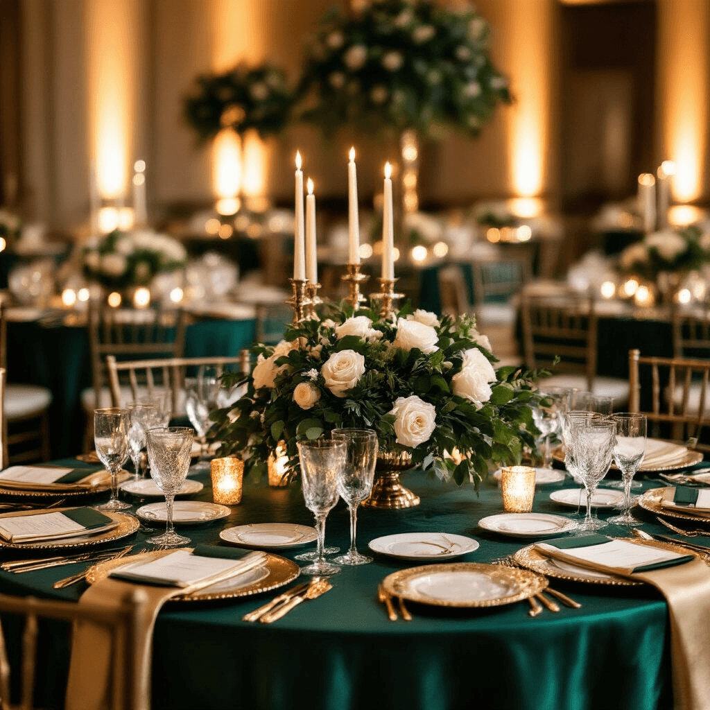
Emerald green, sapphire blue, ruby red, and amethyst purple are winter wedding royalty for a reason.
These rich, saturated colors:
- Photograph incredibly well in low light
- Feel luxurious without trying too hard
- Work with literally any venue style
- Give you that “expensive wedding” vibe even on a budget
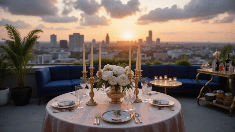
Pair emerald with champagne gold for elegant table linens and watch your reception tables transform.
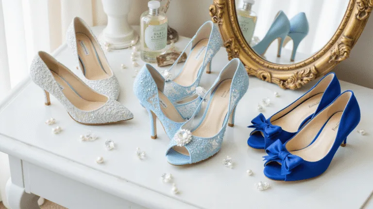
Add sapphire blue bridesmaid dresses with silver metallic table numbers for instant sophistication.
The beauty of jewel tones is they’re basically foolproof.
You’d have to actively try to make them look bad.
Moody Romance: Burgundy, Maroon, and Their Gorgeous Friends
Burgundy isn’t just a color—it’s an entire mood.
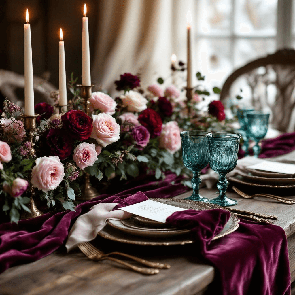
Burgundy and blush creates this romantic, slightly vintage vibe that makes everyone feel like they’ve stepped into a European winter garden.
Use deep burgundy velvet table runners down the center of your tables.
Layer in blush florals with roses, ranunculus, and maybe some dusty pink garden roses if you’re feeling fancy.
Add brass or copper candleholders and suddenly your reception looks like it cost three times what you actually spent.
Maroon and dark teal is for couples who want drama without going full gothic.
This combination says “we have taste and we’re not afraid to use it.”
Skip the bright Christmas red and forest green—those darker, moodier versions feel infinitely more sophisticated and adult.
Incorporate teal through vintage glassware or napkins, use maroon florals as your statement pieces, and watch your photographer get genuinely excited.
Ice Queen Elegance: Cool Tones That Actually Work
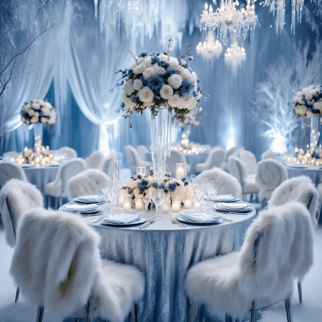
If you’re dreaming of a winter wonderland aesthetic, ice blue and white is your palette.
But here’s the critical part nobody mentions.
You need texture or this combination will photograph as flat and boring as a blank wall.
Layer in:
- Silver sequined linens
- Frosted glass votive holders
- White roses with dusty blue thistle
- Faux fur throws on chairs
- Crystal or glass elements everywhere
The texture creates dimension that makes cool tones pop instead of disappear.
Dusty blue and silver offers a softer version of this aesthetic.
It’s elegant without being cold, sophisticated without feeling stuffy.
Use dusty blue bridesmaid dresses (they’re universally flattering, which your bridesmaids will actually thank you for), add silver through your stationery and table details, and bring in white florals with tons of eucalyptus.
The greenery keeps it from feeling too icy while maintaining that winter elegance.
Unexpected Warmth: Palettes That Break Winter Wedding Rules
Mocha mousse became wildly popular recently, and honestly, I get it.
This warm, sophisticated neutral feels cozy without being boring.
It’s chocolate brown’s elegant cousin who studied abroad and came back with impeccable taste.
Pair mocha with ivory, champagne, or even forest green for a palette that photographs beautifully and feels unique.
Use mocha in your linen napkins, bridesmaid dresses, or as an accent through your stationery.
Add gold metallic touches and amber lighting to make the entire palette glow.
Hunter green and peach sounds weird on paper.
In reality, it’s stunning.
The deep green grounds everything while peach brings unexpected brightness that keeps the palette from feeling too heavy or dark.
Think hunter green bridesmaid dresses with peach rose bouquets, or hunter green velvet ring boxes as gorgeous photo props and ceremony details.
Add natural wood elements like slice chargers or wooden ceremony backdrops to complete the elevated rustic vibe.
The Metallics That Make Everything Better
Gold, silver, and rose gold aren’t just accents—they’re the secret weapons that elevate every palette.
Rose gold and champagne creates modern luxury with romantic softness.
This combination photographs like absolute magic in both natural light and evening reception lighting.
Use rose gold through your flatware, chargers, and stationery.
Bring in champagne with your linens and lighter floral elements.
The result feels expensive and current without being trendy in a way that’ll look dated in five years.
Navy and silver delivers timeless elegance with a slightly masculine edge.
Perfect for couples who want sophistication without anything too romantic or feminine.
Navy bridesmaid dresses, silver details, white florals with tons of greenery, and you’re done.
It works for literally any venue from rustic barns to ballrooms.
Month-by-Month Winter Palette Strategy
December weddings can embrace the holiday season or completely avoid it—your choice.
If you’re leaning in, emerald and champagne


